Design

Last Year, Last Semester: Week 13

Classroom-header.jpg

April is here; design days begin. It’s a milestone and a stepping stone.

I’ve been walking through the school a little slower. I have less than 20 days left as a student there. There are so many details that I haven’t noticed before. There’s rogue graffiti, layers of flyers and messages from the past. I try to remember what it was like in first year. The place is quiet right now but there’s an intensity to it. It’s the evidence of the last bit of focused study. The place has personality and it feels alive. But it’s an old and tired beast ready for a break before everything begins again.

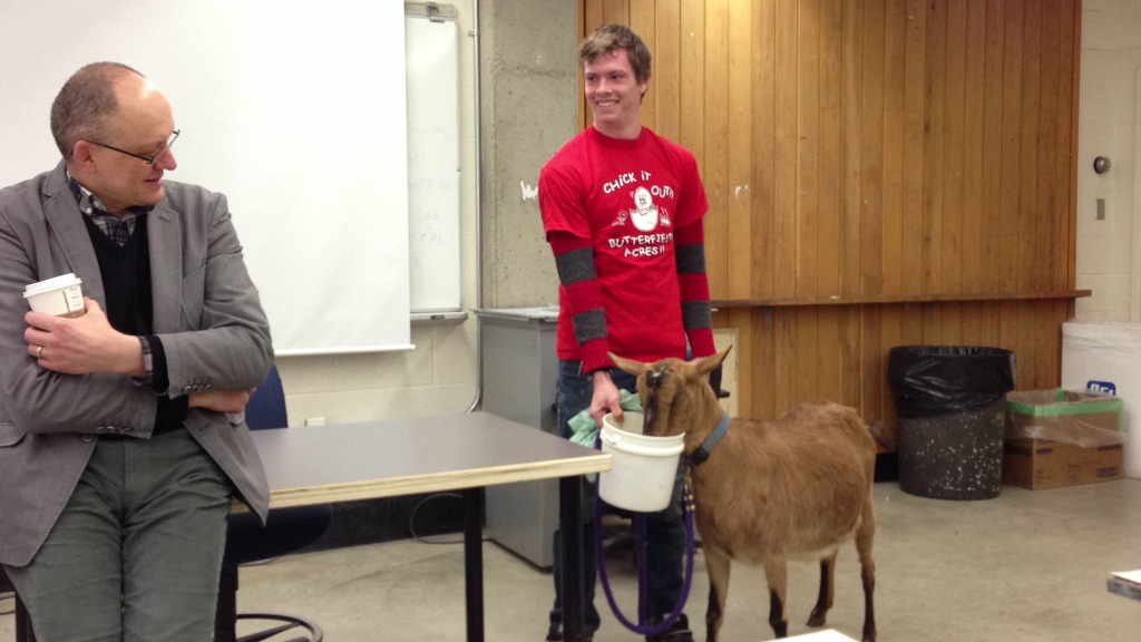
Just before class ended on Tuesday Chris, DylanMariaSara and myself were talking about high school and art classes and where we'd be instead of where we are now if we hadn't come to ACAD. We’re an odd bunch of people brought together by the building. We all have different motivations and reasons and aspirations. I think I'll remember that conversation I had with them fondly. It was like Breakfast Club in real life.

Photography

It’s been nice going out and making photographs for the final photography project. It’s grey and cold out there but you can tell it’s getting warmer. The sun wakes up before I do and when it does snow it melts quicker.

3x3x3-01.jpg
3x3x3-02.jpg
3x3x3-03.jpg

Magazine

The magazine is just about finished. Chris and I have only have minor typographic and layout adjustments to make before we send it to the printer. It was a large project and it seemed near impossible when we were starting out but we put the hours in and we’ll finish on time with no late nights attached.
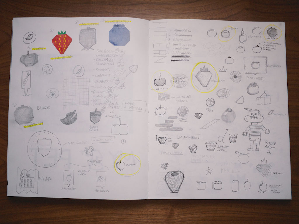
Illustration

Mike Kerr had us work on icons in our sketchbook for illustration class. I came up with a fictional U-Pick farm to be my client. I thought the icons might be useful for a wayfinding system or a map of the fields. I settled with six types of fruit and set up a grid to make the icons on. They ended up being geometric and it was a good challenge getting several similar shaped fruits to look unique (for example, making sure a cherry didn’t look like an apple). We get time in the afternoon to work on our portfolio so I was drawing up some logos for myself. I put together a fun little sketchbook page of the failed ideas.

Sketchbook-upick.jpg
Sketcbook-logo.jpg

Branding

The sushi characters are finished now. They’ve been quite the endeavour but the effort paid off. A good friend of mine in illustration, Nick Johnson, helped me out with their body language and personality. I thought about it for a bit and it reminded me of typography. Someone who doesn’t really know about the structure and details beneath some well set type can still tell it apart from poorly set type. This felt like the exact same thing except with body language and personality. I could tell something was wrong with my characters but I had no idea where to begin with them. Professional help was needed.

​This shows the progression of the character design. You can see when Nick came in to help out at the end.

​This shows the progression of the character design. You can see when Nick came in to help out at the end.

Bonus

Now that the semester is getting crammed I'm running less frequently. I’ll start back up once April is finished but for now this piece from an article by the New York Times has me excited for Spring. 

“Runners who have served as pacesetters for him have told me with amazement how, when he was midrace at Lake Tahoe, Jornet didn't run with his head down in focused misery but instead brushed the hairgrass and corn lily that grew along the trail with his fingertips and brought the smell to his nose, as if he were feeding off the scenery.”

What a way to run.

Last Year, Last Semester: Week 12

​The days are longer. The snow is melting.

​The days are longer. The snow is melting.

It was a simple, short week because of Easter weekend. I finished up a big year long project I’ve been working on, we were given a whole morning of sketchbook time to explore in illustration class and Chris and I finished up a complete version of the magazine.

Second a day

I stayed back after photography class to put the finishing touch on my Second a Day video and upload it to the wild. You can find out more about the project in this post I wrote and at Vimeo. It was great to finish a year of the project and see it live on the web. And then I took a second a day video of my second a day video. Meta, man.

Projector experiments

Chris and I rented out a projector for our magazine project and played with that. We came out with some results we’re happy with and we’re planning a more considered photoshoot for later this week. The experimentation that we did with the typography and the objects has me really excited about the magazine now. We also finished up a complete rough copy of the whole thing at the Editorial Extravabonanzathon Part III so now we can get into one of my favourite parts: detailing.

Projector-001.jpg
Projector-002.jpg
Projector-003.jpg

Sketchbook time

My instructor gave us the whole morning of class to work in our sketchbooks. Ideally we’d be working in these outside of class but sometimes it’s hard to justify spending time on them when you have deadlines to meet. I’m happy to report it was as great as I had hoped it would be. Mike took us through a warm-up exercise and then we just went at it. I did a lot of collage work, cutting up magazines and pasting bits and pieces here and there. I also did some painting, a picture weave and made an alligator pony.

Sketchbook-001.jpg
Sketchbook-002.jpg
Sketchbook-003.jpg
Sketchbook-004.jpg

Last Year, Last Semester: Week 11

Equinox-sunrise.jpg

We’re on the other side of the vernal equinox and graduation is getting closer. Chris and I started to take big steps toward finishing the magazine, the illustrated typography project was due in illustration class and I learned the story of the bork. This week was brought to you by a big effort to get eight hours of sleep every night.

Progress on the magazine

Chris and myself are well underway developing the features of our magazine project. One of the features involves your data and what happens to it once you die. It’s in the spirit of this article. We’ve been taking JPGs, opening them up in text editors and then messing around with the code inside; cutting a few things here and pasting extra characters over there. The whole process is unpredictable and it makes for some nice surprises. For another one of our features we needed some scratchy letters for headlines and subheads. We found some black acrylic and scratched an alphabet into it. All this experimentation has kindled some excitement for the project in us.

Chris and I took both days over the weekend and went into school to work on the magazine. We called the event the Editorial extrava-bonanza-thon and we know there will be at least one sequel. Both of us brought snacks (yogurt covered raisins and Miss Vickie's chips mostly) and pop and went out for lunch to keep spirits high. The most important part was that we set timers and had to complete one spread per hour. They turned out scrappy and pretty rough but it’s an early version and there’s still lots of time left to refine what we’ve done. It’s clear to us now that up until the extrava-bonanza-thon we were spending too much time at once on each spread.

A glitched imaged

A glitched imaged

​The alphabet for the scratch font we made

​The alphabet for the scratch font we made

Illustration critique

The illustrated type project finished up this week and I tried my hardest to step outside my comfort zone. After the critique was over I could tell I treaded too far into unfamiliar territory and should’ve taken some steps back. It’s a bit funny that despite illustrating the phrase “Done is better than perfect” I spent a little too much time pushing and pulling things in an effort to get it just right. Thankfully I was able to pull the project back just by getting rid of the colour. Few other mistakes are fixed that easily but it was a lesson learned regardless.

​The mistake and the fix

​The mistake and the fix

Purchases

Pitch Regular and Pitch Regular Italic are now in my collection of fonts. It also marks the first font I’ve bought (of hopefully many) from Kilm Type Foundry. My friend Laura Sand also picked it up for her branding project.

​Type specimen for Pitch

​Type specimen for Pitch

The story of the bork

I subscribe to the Listserve and I pulled this story out of one of the emails I received from a guy named Chris Morrison.

When I was a kid, my dad used to pick up rocks when I wasn’t looking and hurl them into the forest, where they would crash-crash-crash through dry leaves down a hill. “Do you hear that? It’s the bork!” What a bork was, he left to my imagination. Even at that tender age, I didn’t quite believe in the bork, but I never fully came to disbelieve it either. Today, when I look out into a peaceful forest, I imagine the lumpy form of the bork there: the world’s most mysteriously awkward monster.”

I’ll be thinking of that Bork every time I take walks in the forest now. Here’s another takeaway from his email:

“Human imagination works that way: leave a blank space, and given a starter seed, imagination grows and incorporates fresh details.”

I like that.

Last Year, Last Semester: Week 10

Week 10 featured the creation of my first font, a talk from two ACAD alumni, the big artwork reveal at Centennial Place and a surprise visit from a goat.

On Sunday I created outlines for the letters A–Z for the sushi project. I wanted to actually use it as a functioning typeface so I used some software my buddy Steven showed me some over the summer called Glyphs. It took a bit of work to understand the software but it was worth the time investment; the typeface works great and it’s way faster than copying and pasting letters to make headlines.

The alphabet in Illustrator.​

The alphabet in Illustrator.​

​The letter A in Glyphs.

​The letter A in Glyphs.

Illustration class is a always wonderful and Thursday was no different. My instructor Mike brought in two former students (Josh Holinaty and Genevieve Simms) and they gave us a little talk. They shared their work and their process and gave us a few tips too. Josh showed us this great default brush in Photoshop that gives you some nice texture. Here’s a little explosion of colour I threw together with the newfound brush.

Pattern-01.jpg

The real highlight of the week was the Centennial Place × Oxford Properties art unveiling. Another ACAD alumni, Christian Eckart, was commissioned for a large art piece that’s now installed in the public area of the building. The evening was one of the fanciest things I’ve ever been too and the whole design team looked especially great. Laura Sand, Nicole Edmond, Nikki Stephens and my previous instructor Naoko Masuda joined me. The whole team was happy with how our small part of the project turned out. The previous posts that have included photos of screen printing and box making are related to this project. Oxford Properties approached the school to create 35 glass sculptures to commemorate the unveiling of Christian’s piece. The glass sculptures needed to be packaged so they collaborated with the visual communications department. We needed help with printing so we contacted the print media department. It was a wonderful cross-disciplinary project and something I hope to see more of at ACAD.

​One of the parts of the sculpture created by Christian.

​One of the parts of the sculpture created by Christian.

​The design team reflected in Christian's piece.

​The design team reflected in Christian's piece.

My classmate Michael Kohlweg brought a goat into class to end the week. It was for an Advertising stunt he was working on. 30% of the photos uploaded and tagged at the college that day were of the goat. It looks like it was an overwhelming success and I’m excited to see how the whole thing turns out. He’s got some great footage to edit together.

​The goat's handler and my instructor, Rik Zak.

​The goat's handler and my instructor, Rik Zak.

Last Year, Last Semester: Week 9

“If it's not possible to sleep all day, then do the closest possible equivalent. Resting is crucial, your unconscious needs the day.”

The week started with this screenshot posted by Jack Cheng that came to him through an email from Miranda July. I thought the way it flipped what some of us normally do (pack the day full and sleep in the leftover time) was pretty clever. In this case the day should be packed full of resting with the leftover time spent working. That wouldn’t always work but it makes for some nice, challenging thinking.

On Thursday I was reading Pixar’s 22 Rules of Storytelling. I quite like 8 and 9:

8. Finish your story, let go even if it’s not perfect. In an ideal world you have both, but move on. Do better next time.

9. When you’re stuck, make a list of what WOULDN’T happen next. Lots of times the material to get you unstuck will show up.

Number 8 relates to my illustration class right now. I’m taking the saying around Facebook that “Done is better than perfect” and illustrating the typography. See, it’s not about making a ton of low-quality stuff (or what my teacher, Xerxes Irani, calls “green goo”), instead it’s about actually finishing things; not just having an idea, starting it and then abandoning it halfway because what you're making “isn't good enough”. And Number 9 just seems like a great way to get rid of a creative block.

​GIF from the photo shoot

​GIF from the photo shoot

Thursday night was a photo shoot for photography class with my friend Kristen Foran. She has an interesting practice that spans a bunch of media and I wanted to capture her in her studio space before she graduates and moves out. This is a fun little GIF of her dropping pompoms everywhere.

I was on the other side of the camera this time.

I was on the other side of the camera this time.

On Friday I was on the other side of the camera for a photo shoot. Some friends of mine needed a model for their magazine project and I happily accepted. In addition to it being quite fun I tried to observe the lighting setup the photographer was using. Maybe I'll be able to try it out on one of my projects?

Today also marks a very exciting anniversary of a project I’m working on. But more about that next week. For now, a teaser of what’s to come.

year-one.jpg

Last Year, Last Semester: Week 8

Reading break is completed. The final stretch begins.

The train was great this whole week and on Thursday I didn't listen to any music – I just focused on the sounds. When I thought about everyone looking in a mirror that morning to get ready I couldn't help but smile. It’s a shared ritual that I think we all forget we do. It's also that time of year when the sun is rising right as I'm riding the train. There’s lots of soft light spilling everywhere.

The creative director of a local agency called Foundry, Zahra Al-harazi, talked to the fourth year advertising class and I was able to sneak in (since I’m taking illustration that day). She shared her perspective of the design industry and it was great to have a female speaker come in (most of the speakers I’ve seen up until this point have been men). What really stood out was this statistic she brought up: only 3% of creative directors are women. I did a bit more research and Kathy Delaney, chief creative officer of Saatchi & Saatchi Wellness says that a lot of brilliant women “are forced to make that choice [between family and work]”. It’s unfortunate that agencies can’t strike a better work/life balance to retain those women. Their perspective couldn’t be more valuable when women control 80% of consumer spending.

2013-02-27 at 18-40-43.jpg

The assembly line of box production was operating at peak efficiency this week. Nikki, Laura and myself cut them, scored them, folded them and glued them. Then we moved onto the sleeves which required more cutting and scoring. Nikki went out to pick up the stamp for the sleeves and came back with stories and some ink and the stamp. It worked wonders and better than I expected (white ink on black paper; I thought it might be tough).

Some extras bits:

I grabbed this paragraph about interaction design from this site. It might be a bit narrow and limiting but I liked it:

“While graphic design is meant to be observed, interaction design helps humans experience or manipulate software or interface with screen-based hardware in order to achieve specific goals – checking email, withdrawing money from an ATM, or "Liking" a webpage…”

I’ve been following Kevin Russ on Instagram for a while and he mentioned an application called avgcampro. I tried it out and I wanted to share a test image. Basically it takes multiple pictures and calculates the average picture out of them and normalizes the result so the lightest pixel become white. It’s great if you need low noise photographs that are taken in low light but I found it also has some nice experimental uses.

Averaged photo of my closet.

Averaged photo of my closet.

I’m still reading On Photography by Susan Sontag. This part that I'm quoting pokes a bunch of holes in what I was thinking about last week with Vine. Vine isn’t TV but it is a moving image.

“Photographs may be more memorable than moving images, because they are a neat slice of time, not a flow. Television is a stream of underselected images, each of which cancels its predecessor.”

​Snagged this photo from the bands website. Used without permission.

​Snagged this photo from the bands website. Used without permission.

The soundtrack to this past week was the album Dream Island Laughing Language by Lucky Dragons and the song Gyroscope by Boards of Canada. In both cases it’s music from a faraway land.