Design School

Last Year, Last Semester: Final Week

2013-04-22-at-13-25-07.jpg

This picture is from the first classroom I stepped in at ACAD. It’s the visual communications room for my Design fundamentals class. My teacher was Karl Geist  and he introduced me to the school. I remember he asked me what I was interested in and I said Swiss design. I was completely unaware of any design history or what that actually meant; at that point I was just basing everything I knew about design off some posters I had seen on the web. I sat underneath the windows and light would pour in from outside. I started my education at ACAD in that room. And last week, four years later when I finished my final critique, I walked into that room and sat down to think. I thought about where I was in the beginning and where I am now.

The last week of the semester was spent presenting projects, working on portfolios and preparing things for the portfolio show. It was hectic and there were late nights but what encouraged me to keep going was knowing that everyone else in the program was going through the same thing.​ We all had the same late nights, the same anxieties and the same excitement.

It’s funny how I still remember some of the first interactions with then-strangers who I now call friends. Most were inevitable introductions in a program size of only 60 and most were shared smiles or laughter and then an exchange of names. But some of those first interactions persist in memory. I first talked to Laura Sand in an introductory jewelry class. When I first saw Justine Anweiler I unknowingly gave her a look that she later told me was filled with disapproval. Nikki Stephens sat behind me in that Design fundamentals class. I smiled at Kelsey Hughes when I dropped off my application portfolio for second year. One of the first conversations I had with Chris Turner was about the laser cutter at his work. I remember being intimidated by Nick Johnson’s skill in a design drawing class. Laura Russell sat across from me in communications design when we were drawing logos based on flowers. Allison Swertz came up to me in Concepts class and complimented me on a project about road signs. Ryder McLean sat beside me in almost all of my second year classes and I first talked to Jun Ren in information design when he told me all the places he had lived around the world.

These people I’ve been with for four years have shaped me and enlightened me and taught me things I never would’ve learned by myself. One of my teachers said this group of people is the strongest support network I’ll ever have. I believe him.

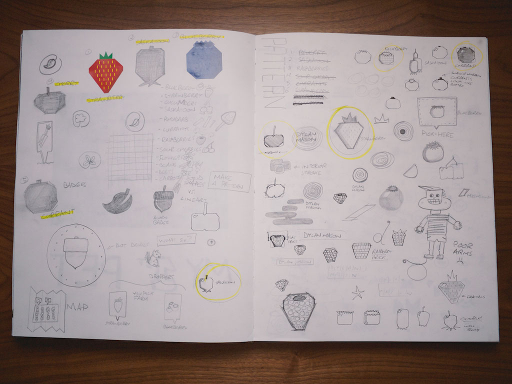
I've learned more than I ever expected to in these last four years. I've taken a jewelry class where I made necklaces and rings. I’ve taken a printing class where I tried linocut, screen printing and photo intaglio. There were art history classes that brought us back to the paintings in the Lascaux Caves. And then there was my design education: craft, typography, advertising, branding, illustrations and presentations.

I feel fortunate to have studied under such smart and caring teachers. They challenged me and supported me and made me a capital-D Designer. They did more than that though; they made me a better person. They taught me empathy and understanding. Teaching is a noble profession and I have a deep respect for what they do.

I can’t agree with anyone who says the four years went quickly. It was long and it’s getting harder for me to remember what it was like before my time at ACAD. I have a relationship with the building and the people there and while there is relief and excitement about being finished I’m sad that my time as a student there is done. The growth I experienced at the college was unlike any other in my life.

Here’s to the amazing time, people and memories.

Last Year, Last Semester: Week 15

Calender.png

It’s the last little bit of the marathon and it feels the part. It takes a lot of focus to keep going.

To prepare for the big shift from school projects to paying projects I’ve started tracking the time I spend working with Harvest. It would’ve been a good idea to start doing this while I was still in school but I’m in the habit of recording and scheduling working time in Calendar already (that's probably evident from the heat maps above). The benefit of Harvest is that it provides some really nice reporting, estimating and invoicing tools. I’m about a third through the free trial and it’s neat to see where my time is going and all the hours that were sucked out working on something else.

​Also included in the rewards for being a backer was a letterpress bookmark and your name in the back of the book. Jack added in a nice thank you card too.

​Also included in the rewards for being a backer was a letterpress bookmark and your name in the back of the book. Jack added in a nice thank you card too.

A book I backed on Kickstarter arrived. It’s called These Days by Jack Cheng. He provided weekly updates about the project to his backers which was the original motivation to do these updates about my last semester. Here’s a two sentence synopsis of the book:

A guy who designs prop computer interfaces meets a girl who doesn't own a cellphone. A story about the human side of technology.

I'm looking forward to reading it full time once school is finished.​

We also had our last day of illustration and the sketchbook assignment was “change”. We took an old drawing and then redrew it again in different styles. My teacher Mike also brought in all his old work. It’s amazing to see how much he’s changed over his career. It made sense why he wanted that to be the theme of the sketchbook exercise for the last day. I took some photos of the work that I did in the morning.

​I took my pattern and drew it in line and then focused on the negative space on the page.

​I took my pattern and drew it in line and then focused on the negative space on the page.

​I took some of the faces from the pattern and made them huge.

​I took some of the faces from the pattern and made them huge.

Drawing one of the faces with a single continuous line only.

Drawing one of the faces with a single continuous line only.

​Painting one of the faces with a palette knife.

​Painting one of the faces with a palette knife.

I was working on the presentation for the sushi project the day before it was due and green tea and my Retrospective playlist on Rdio fuelled the night. Bed was at 2:15. That's much later than normal but it was fun. Late nights are exciting every once in a while but a terrible habit to get into.

When we arrived for the critique Friday morning a few of us met and breathed a collective sigh of relief. Even though there was still hints of anxiety about how the presentation would go there was no more time to make changes and we were going up with what we had. It's nice to have that finish line. Otherwise I can see us making adjustments endlessly. The critique was long but it was good to see everyone’s work. There was laughing and applause and congratulations and some people even did a little bit of napping. But we did it together. There was such camaraderie at the end. My instructor Xerxes reminded us these people are the strongest support network we’ll ever have.

The days left can be counted on one hand. Only a few more paces to the finish line.

Last Year, Last Semester: Week 14

Header.jpg

Finishing touch

The magazine is done. Chris and I went through the whole thing and did the final detailing. We uploaded it to the printer on Tuesday and felt no relief. I think it’s because you don’t get anything tangible. Even the receipt they send to you is just an email that gets filed away into a folder or deleted. Once the our copies of the magazine arrive I’m sure we’ll feel differently.

The “Future”

The sketchbook project in Illustration was about the theme of “future” this week. Mike took a large sheet of paper and placed it at the front of the room and he had all of us work on a communal drawing. He brought in some printmaker’s ink and rollers so we were stencilling all over it. I made some patterns and turned some triangles in a robot. There’s a photo of the sketchbook work from the day too.

​The big communal piece of paper the class drew on.

​The big communal piece of paper the class drew on.

​The sketchbook page from this week.

​The sketchbook page from this week.

Marimekko, with love

There was a presentation on Marimekko in the lecture theatre during the week. There were so many great people that I had met throughout my time at ACAD there; lots of people who I shared first year classes with before we split off into our departments. Not only was the presentation interesting but I also left the talk with great feelings about where the school is headed. The presenter mentioned how important it is to explain why cultural institutions matter. I’ve lived in a bubble for four years and now is a great time to show the world why they exist and why they make a difference.

​Unikko, designed by Maija Isola.

​Unikko, designed by Maija Isola.

Chauffeured

I took the bus home one day and for about twenty minutes it was only the driver at the front of the bus and me at the back. It felt like I had lots of money and was being privately driven around in a large and somewhat smelly limousine.

Last Year, Last Semester: Week 13

Classroom-header.jpg

April is here; design days begin. It’s a milestone and a stepping stone.

I’ve been walking through the school a little slower. I have less than 20 days left as a student there. There are so many details that I haven’t noticed before. There’s rogue graffiti, layers of flyers and messages from the past. I try to remember what it was like in first year. The place is quiet right now but there’s an intensity to it. It’s the evidence of the last bit of focused study. The place has personality and it feels alive. But it’s an old and tired beast ready for a break before everything begins again.

Just before class ended on Tuesday Chris, DylanMariaSara and myself were talking about high school and art classes and where we'd be instead of where we are now if we hadn't come to ACAD. We’re an odd bunch of people brought together by the building. We all have different motivations and reasons and aspirations. I think I'll remember that conversation I had with them fondly. It was like Breakfast Club in real life.

Photography

It’s been nice going out and making photographs for the final photography project. It’s grey and cold out there but you can tell it’s getting warmer. The sun wakes up before I do and when it does snow it melts quicker.

3x3x3-01.jpg
3x3x3-02.jpg
3x3x3-03.jpg

Magazine

The magazine is just about finished. Chris and I have only have minor typographic and layout adjustments to make before we send it to the printer. It was a large project and it seemed near impossible when we were starting out but we put the hours in and we’ll finish on time with no late nights attached.

Illustration

Mike Kerr had us work on icons in our sketchbook for illustration class. I came up with a fictional U-Pick farm to be my client. I thought the icons might be useful for a wayfinding system or a map of the fields. I settled with six types of fruit and set up a grid to make the icons on. They ended up being geometric and it was a good challenge getting several similar shaped fruits to look unique (for example, making sure a cherry didn’t look like an apple). We get time in the afternoon to work on our portfolio so I was drawing up some logos for myself. I put together a fun little sketchbook page of the failed ideas.

Sketchbook-upick.jpg
Sketcbook-logo.jpg

Branding

The sushi characters are finished now. They’ve been quite the endeavour but the effort paid off. A good friend of mine in illustration, Nick Johnson, helped me out with their body language and personality. I thought about it for a bit and it reminded me of typography. Someone who doesn’t really know about the structure and details beneath some well set type can still tell it apart from poorly set type. This felt like the exact same thing except with body language and personality. I could tell something was wrong with my characters but I had no idea where to begin with them. Professional help was needed.

​This shows the progression of the character design. You can see when Nick came in to help out at the end.

​This shows the progression of the character design. You can see when Nick came in to help out at the end.

Bonus

Now that the semester is getting crammed I'm running less frequently. I’ll start back up once April is finished but for now this piece from an article by the New York Times has me excited for Spring. 

“Runners who have served as pacesetters for him have told me with amazement how, when he was midrace at Lake Tahoe, Jornet didn't run with his head down in focused misery but instead brushed the hairgrass and corn lily that grew along the trail with his fingertips and brought the smell to his nose, as if he were feeding off the scenery.”

What a way to run.

Last Year, Last Semester: Week 12

​The days are longer. The snow is melting.

​The days are longer. The snow is melting.

It was a simple, short week because of Easter weekend. I finished up a big year long project I’ve been working on, we were given a whole morning of sketchbook time to explore in illustration class and Chris and I finished up a complete version of the magazine.

Second a day

I stayed back after photography class to put the finishing touch on my Second a Day video and upload it to the wild. You can find out more about the project in this post I wrote and at Vimeo. It was great to finish a year of the project and see it live on the web. And then I took a second a day video of my second a day video. Meta, man.

Projector experiments

Chris and I rented out a projector for our magazine project and played with that. We came out with some results we’re happy with and we’re planning a more considered photoshoot for later this week. The experimentation that we did with the typography and the objects has me really excited about the magazine now. We also finished up a complete rough copy of the whole thing at the Editorial Extravabonanzathon Part III so now we can get into one of my favourite parts: detailing.

Projector-001.jpg
Projector-002.jpg
Projector-003.jpg

Sketchbook time

My instructor gave us the whole morning of class to work in our sketchbooks. Ideally we’d be working in these outside of class but sometimes it’s hard to justify spending time on them when you have deadlines to meet. I’m happy to report it was as great as I had hoped it would be. Mike took us through a warm-up exercise and then we just went at it. I did a lot of collage work, cutting up magazines and pasting bits and pieces here and there. I also did some painting, a picture weave and made an alligator pony.

Sketchbook-001.jpg
Sketchbook-002.jpg
Sketchbook-003.jpg
Sketchbook-004.jpg

Last Year, Last Semester: Week 11

Equinox-sunrise.jpg

We’re on the other side of the vernal equinox and graduation is getting closer. Chris and I started to take big steps toward finishing the magazine, the illustrated typography project was due in illustration class and I learned the story of the bork. This week was brought to you by a big effort to get eight hours of sleep every night.

Progress on the magazine

Chris and myself are well underway developing the features of our magazine project. One of the features involves your data and what happens to it once you die. It’s in the spirit of this article. We’ve been taking JPGs, opening them up in text editors and then messing around with the code inside; cutting a few things here and pasting extra characters over there. The whole process is unpredictable and it makes for some nice surprises. For another one of our features we needed some scratchy letters for headlines and subheads. We found some black acrylic and scratched an alphabet into it. All this experimentation has kindled some excitement for the project in us.

Chris and I took both days over the weekend and went into school to work on the magazine. We called the event the Editorial extrava-bonanza-thon and we know there will be at least one sequel. Both of us brought snacks (yogurt covered raisins and Miss Vickie's chips mostly) and pop and went out for lunch to keep spirits high. The most important part was that we set timers and had to complete one spread per hour. They turned out scrappy and pretty rough but it’s an early version and there’s still lots of time left to refine what we’ve done. It’s clear to us now that up until the extrava-bonanza-thon we were spending too much time at once on each spread.

A glitched imaged

A glitched imaged

​The alphabet for the scratch font we made

​The alphabet for the scratch font we made

Illustration critique

The illustrated type project finished up this week and I tried my hardest to step outside my comfort zone. After the critique was over I could tell I treaded too far into unfamiliar territory and should’ve taken some steps back. It’s a bit funny that despite illustrating the phrase “Done is better than perfect” I spent a little too much time pushing and pulling things in an effort to get it just right. Thankfully I was able to pull the project back just by getting rid of the colour. Few other mistakes are fixed that easily but it was a lesson learned regardless.

​The mistake and the fix

​The mistake and the fix

Purchases

Pitch Regular and Pitch Regular Italic are now in my collection of fonts. It also marks the first font I’ve bought (of hopefully many) from Kilm Type Foundry. My friend Laura Sand also picked it up for her branding project.

​Type specimen for Pitch

​Type specimen for Pitch

The story of the bork

I subscribe to the Listserve and I pulled this story out of one of the emails I received from a guy named Chris Morrison.

When I was a kid, my dad used to pick up rocks when I wasn’t looking and hurl them into the forest, where they would crash-crash-crash through dry leaves down a hill. “Do you hear that? It’s the bork!” What a bork was, he left to my imagination. Even at that tender age, I didn’t quite believe in the bork, but I never fully came to disbelieve it either. Today, when I look out into a peaceful forest, I imagine the lumpy form of the bork there: the world’s most mysteriously awkward monster.”

I’ll be thinking of that Bork every time I take walks in the forest now. Here’s another takeaway from his email:

“Human imagination works that way: leave a blank space, and given a starter seed, imagination grows and incorporates fresh details.”

I like that.