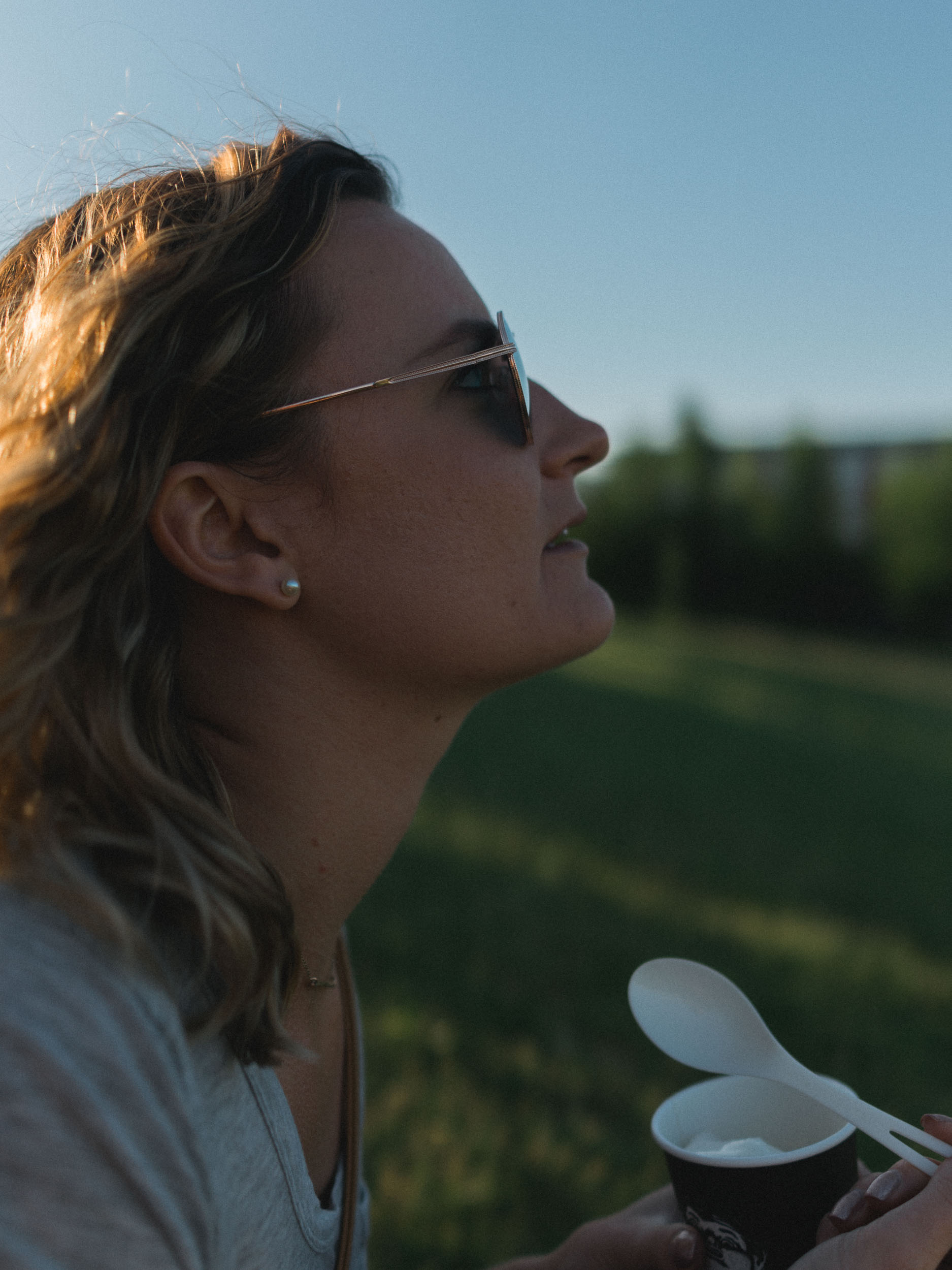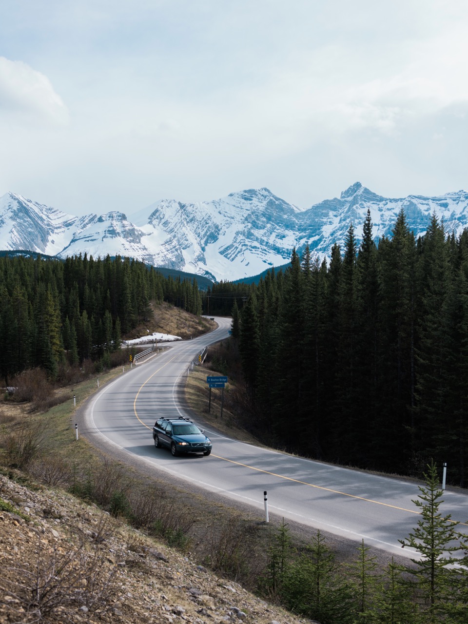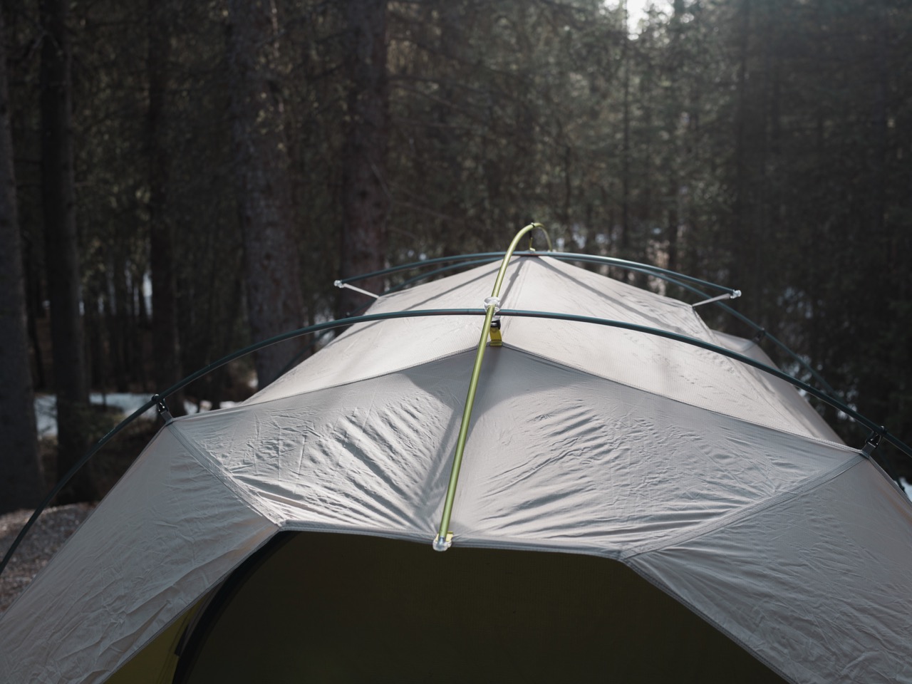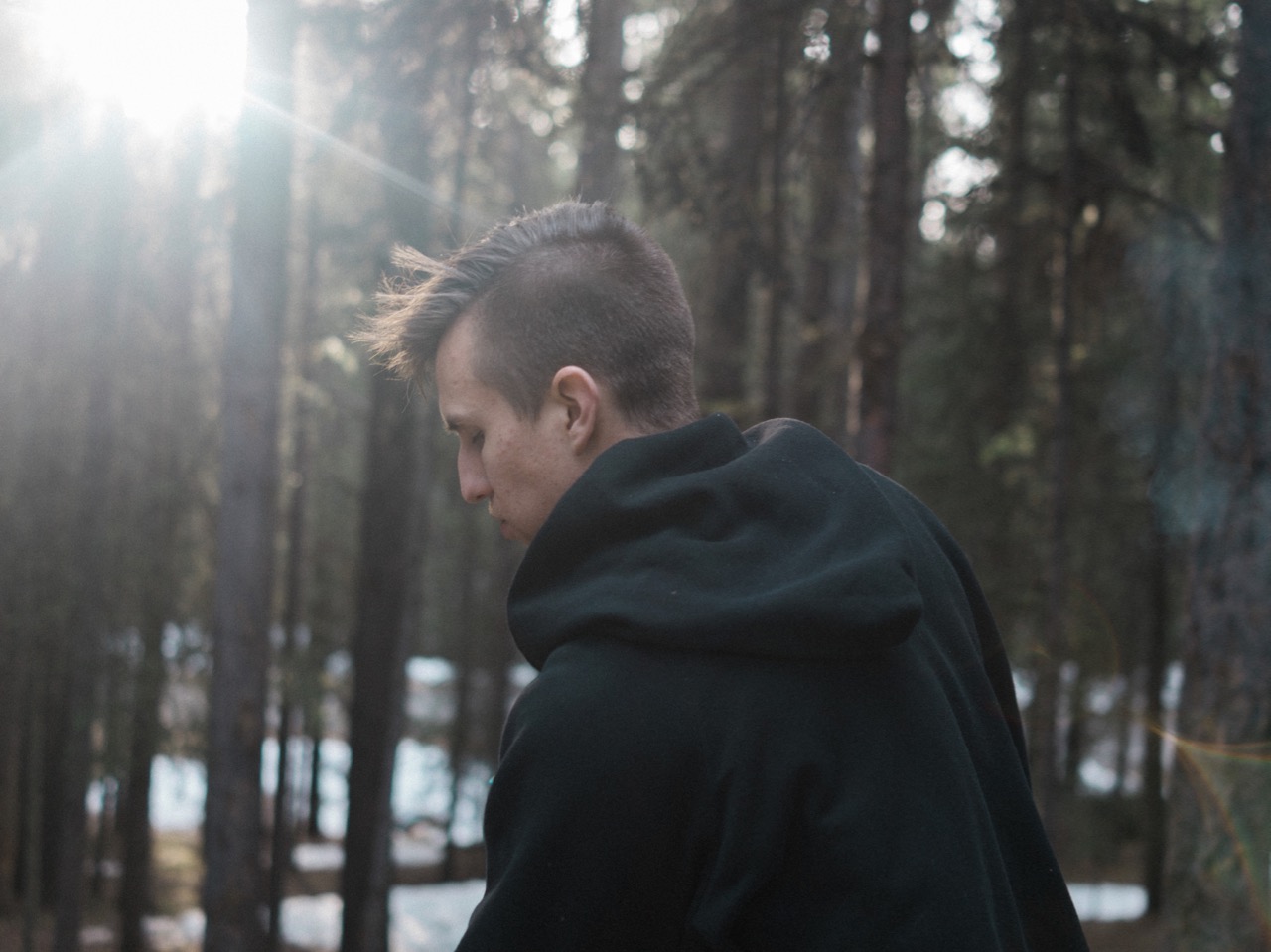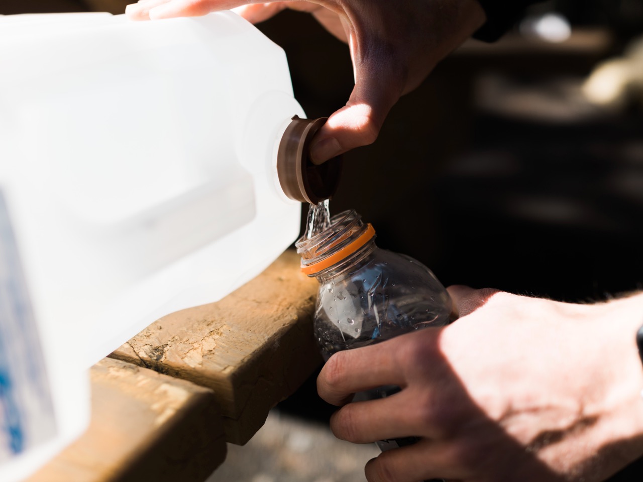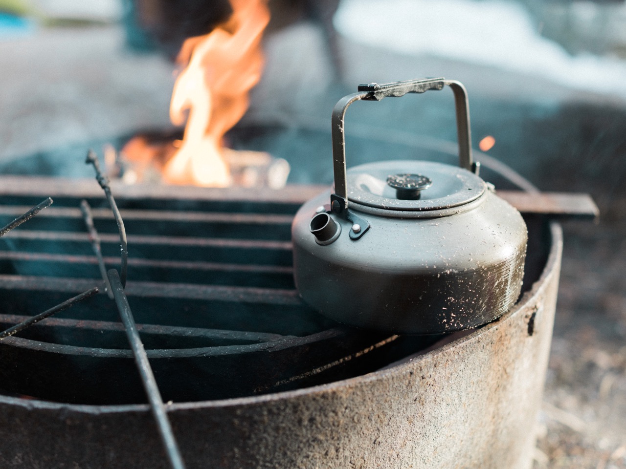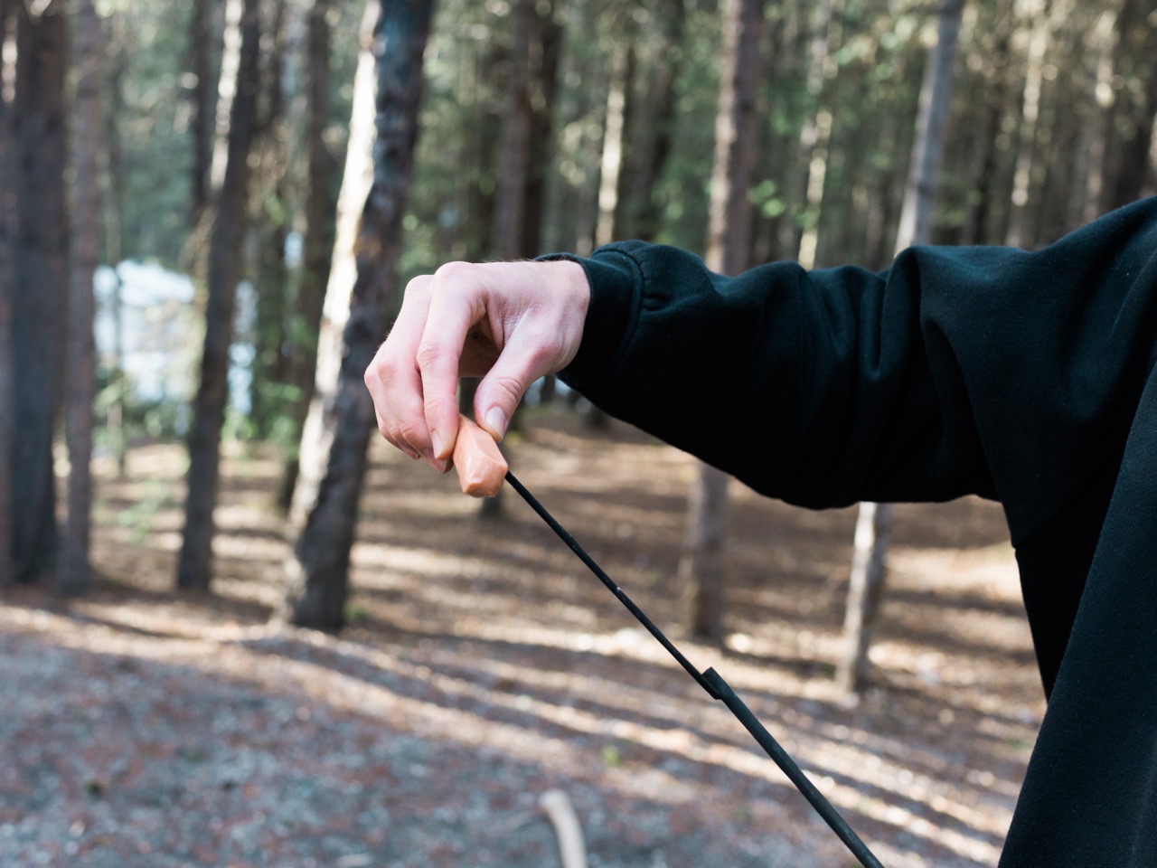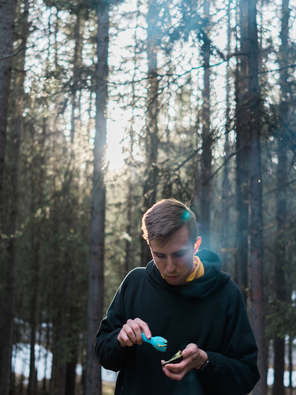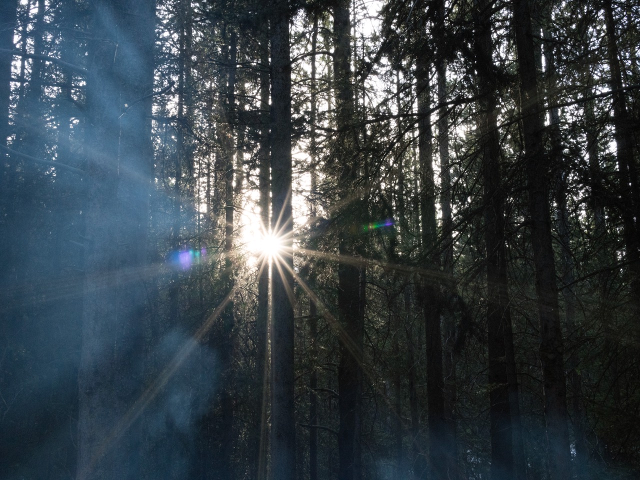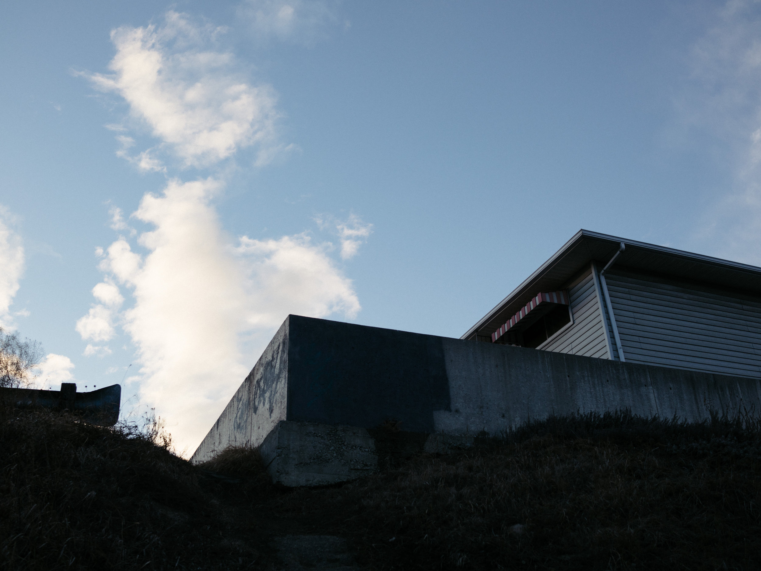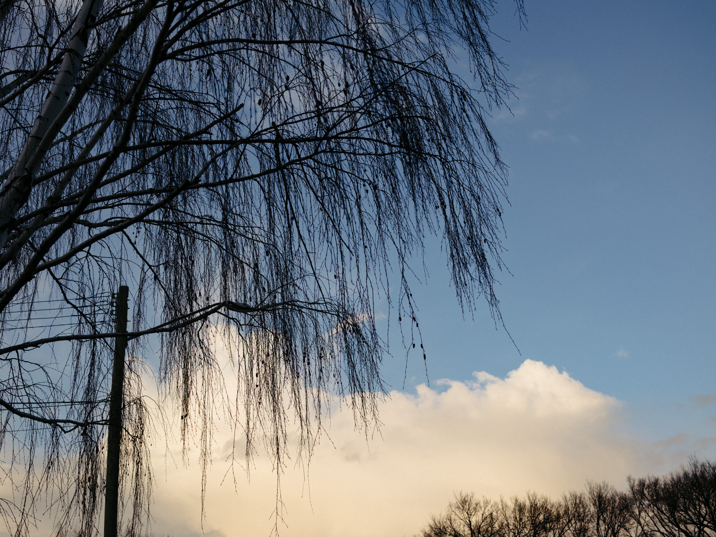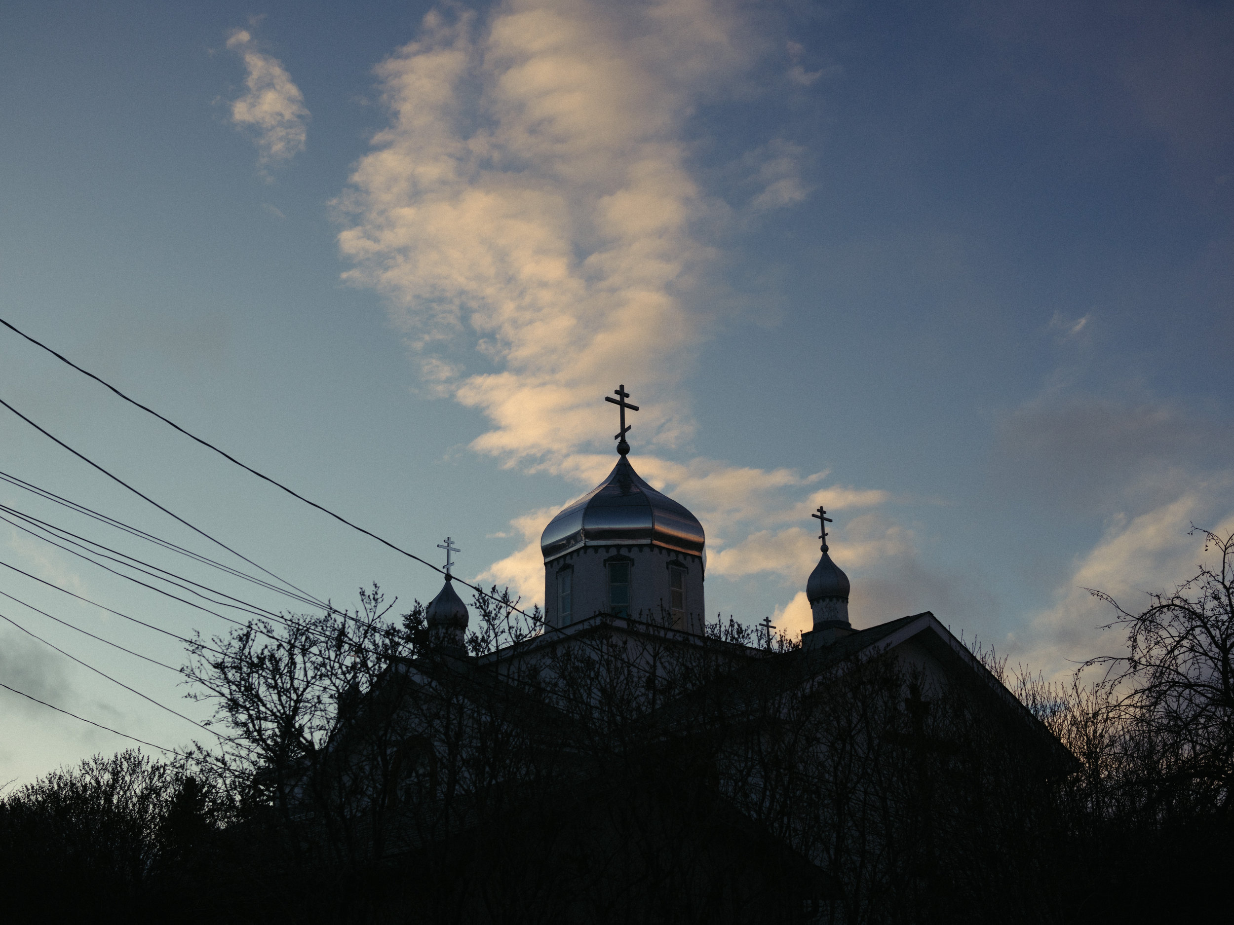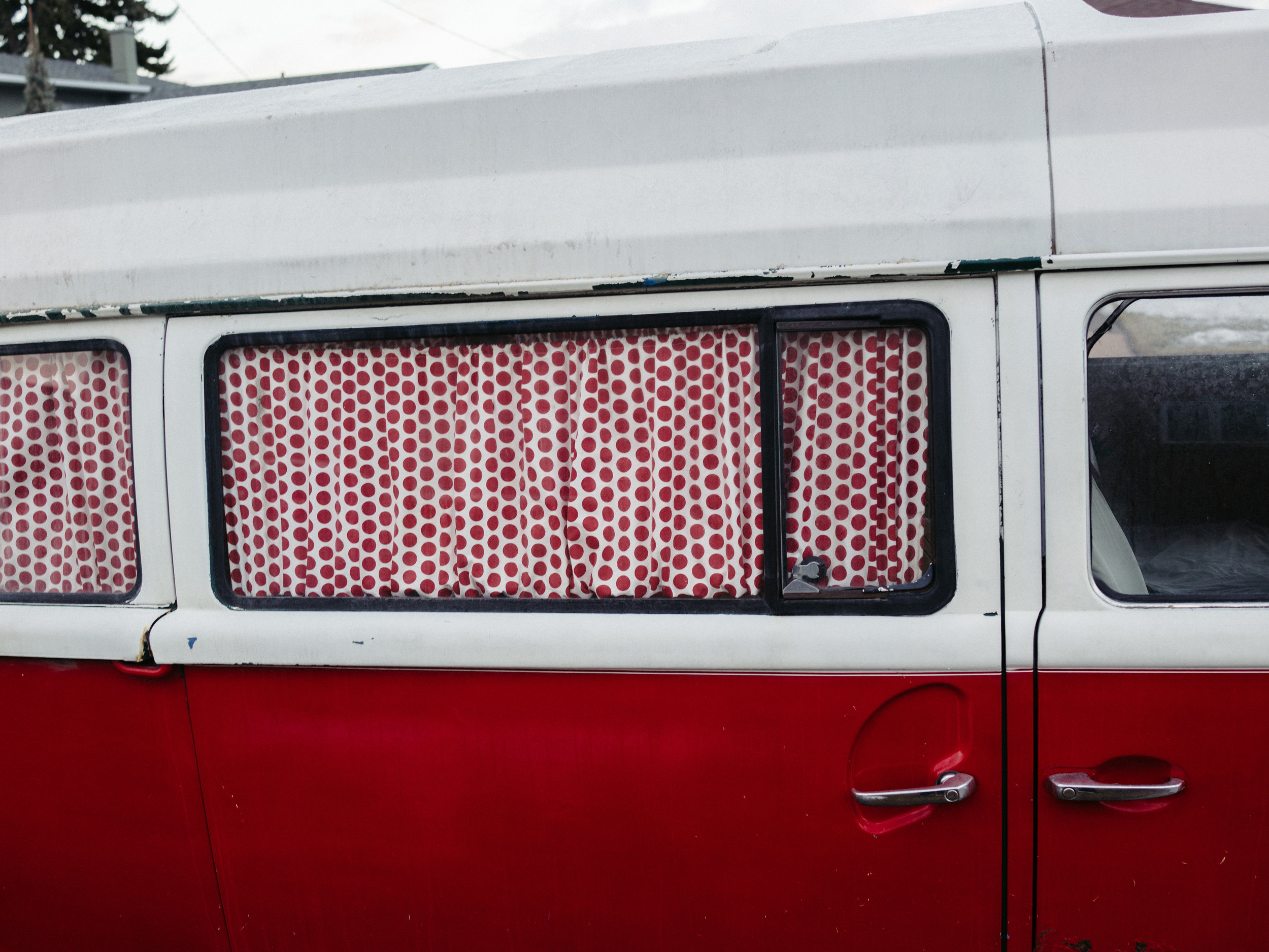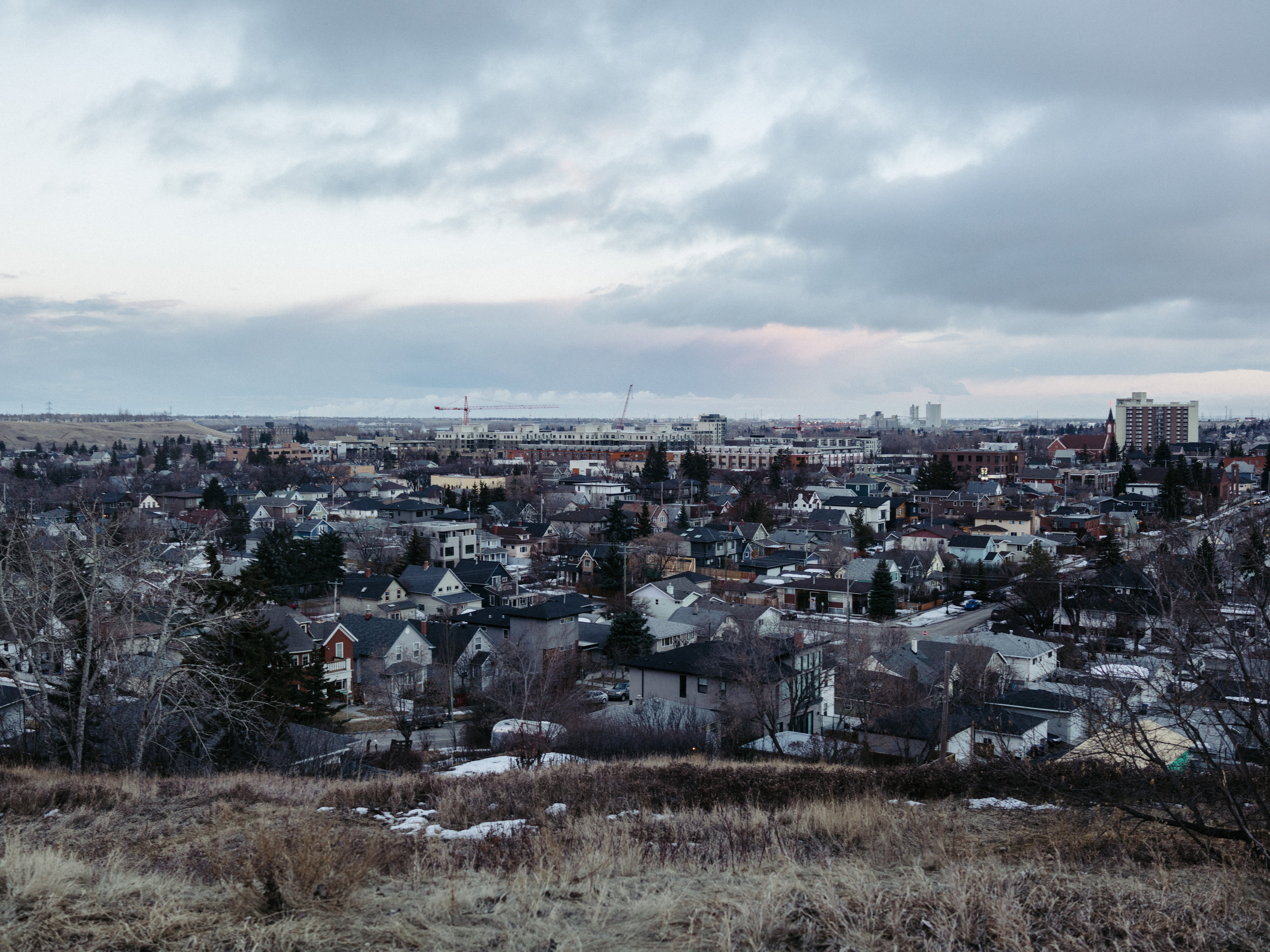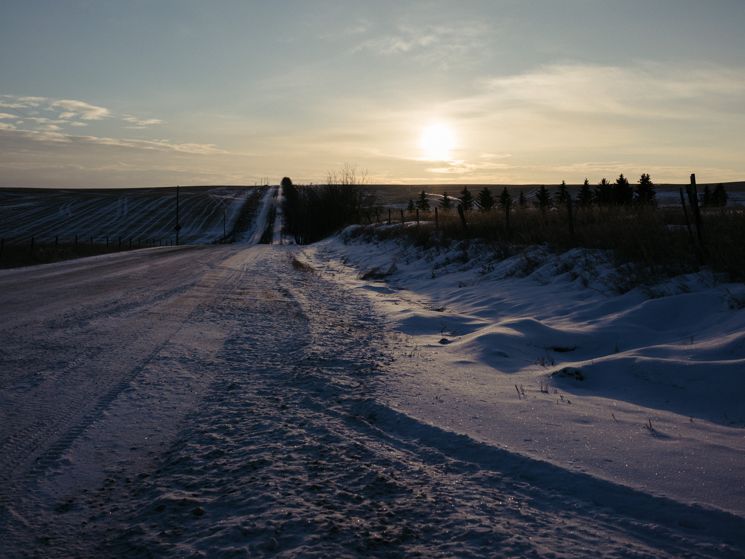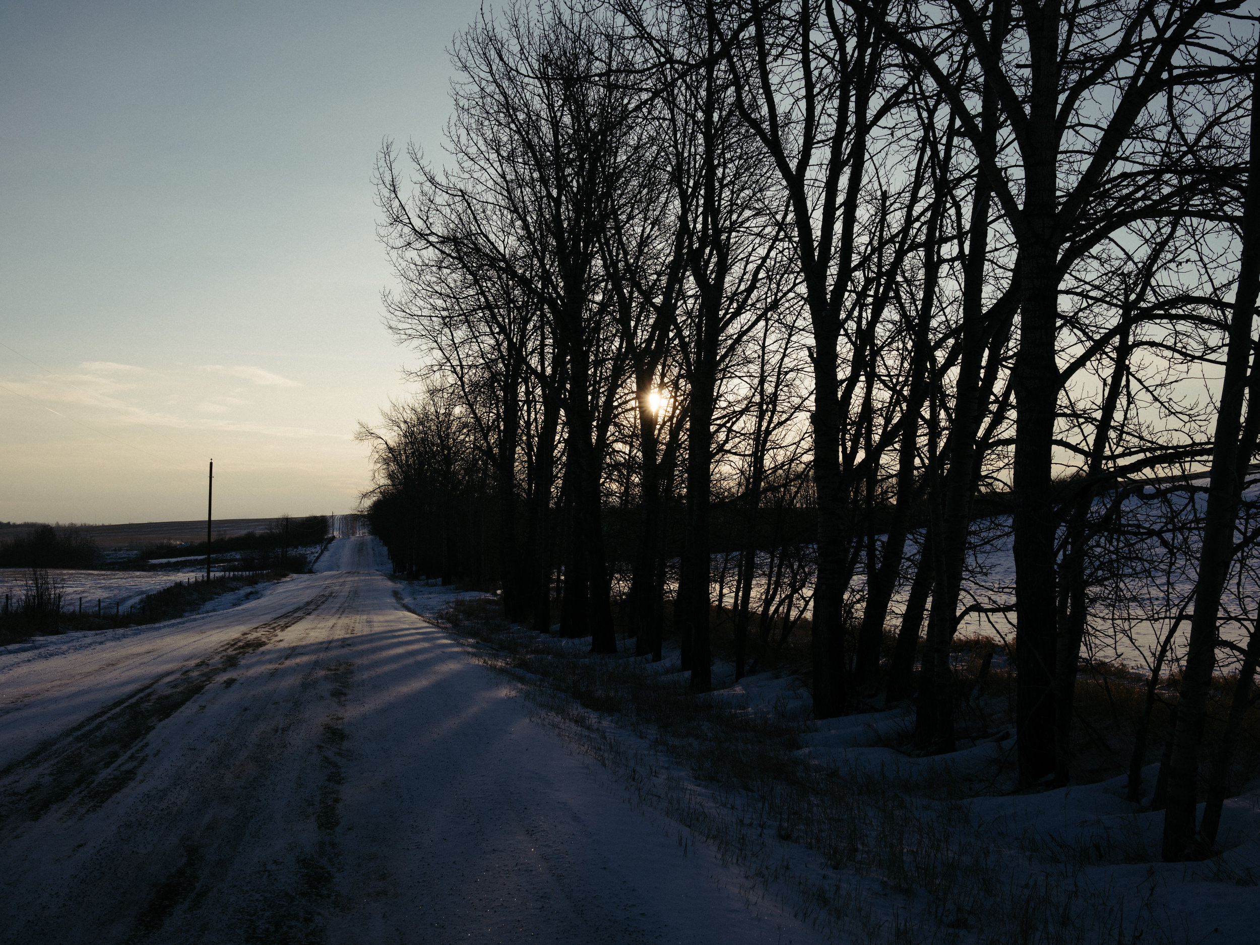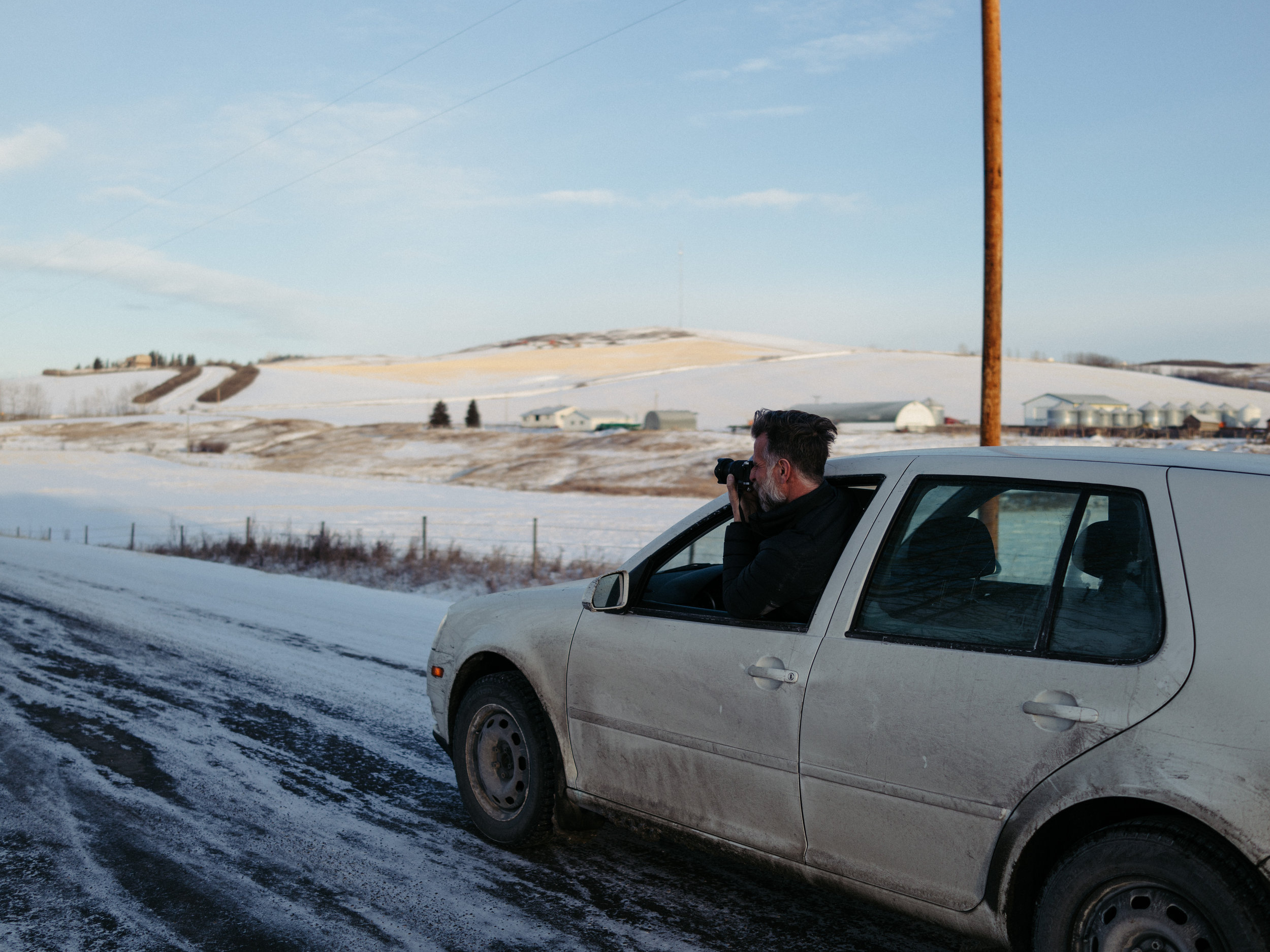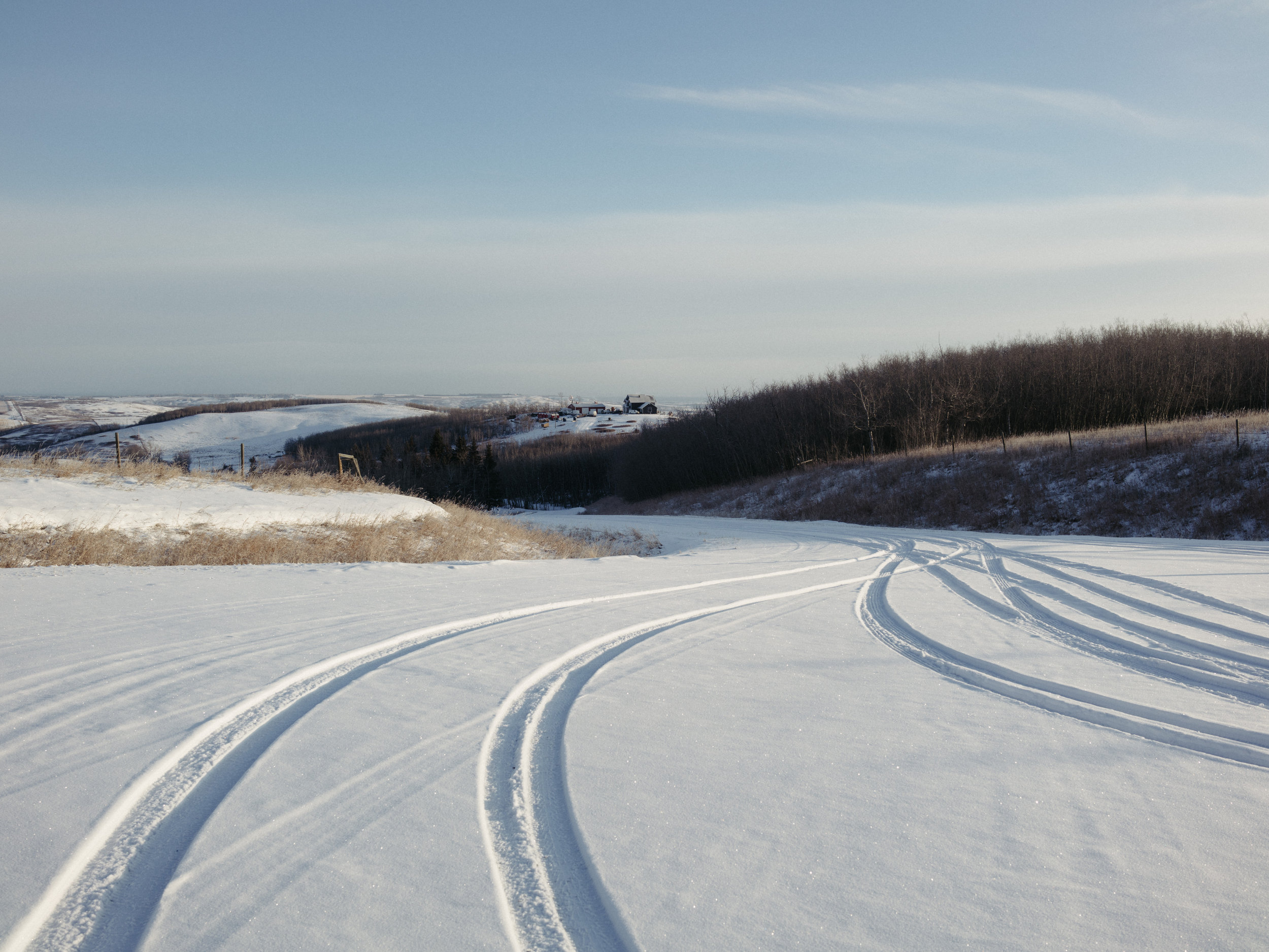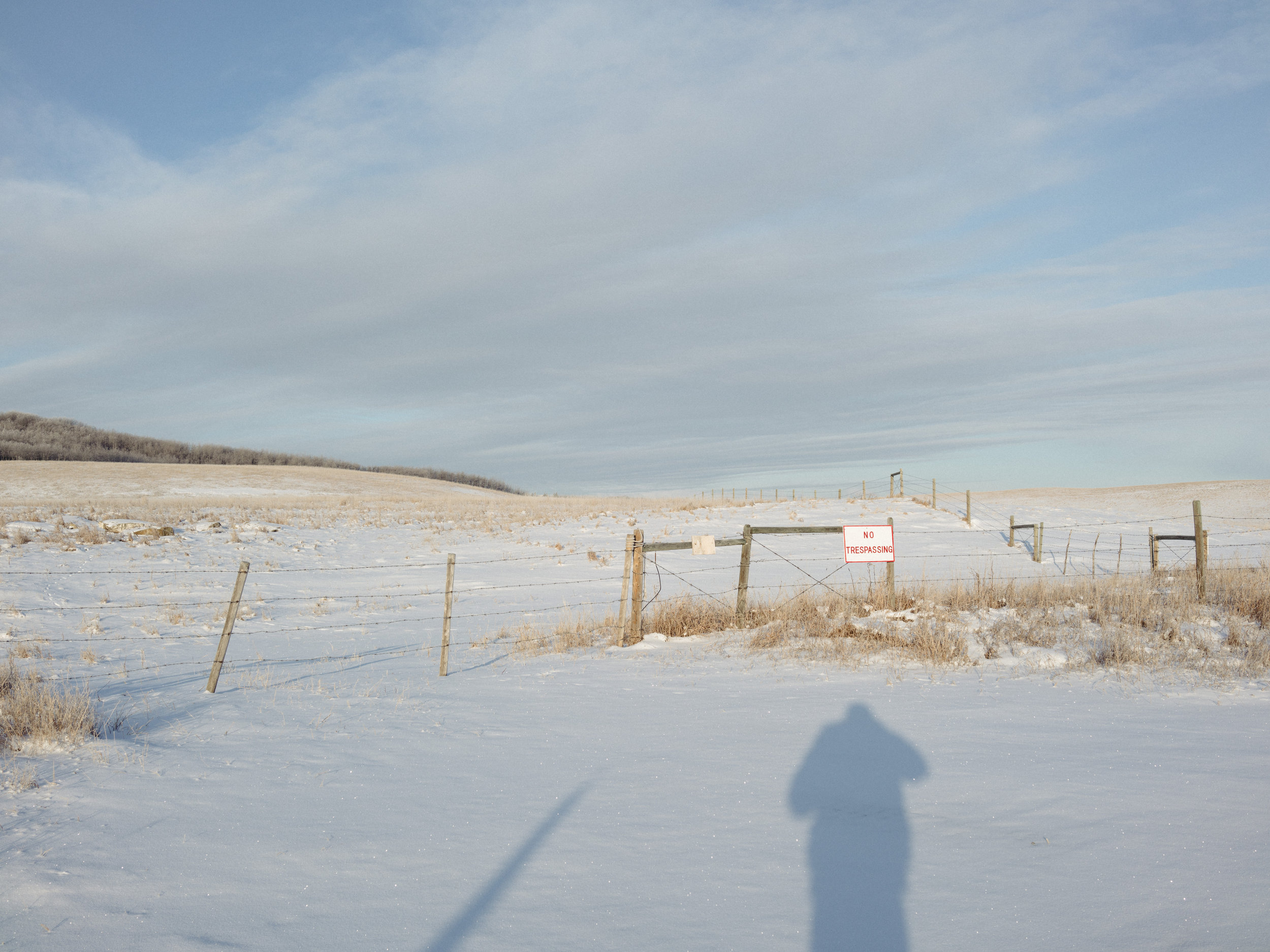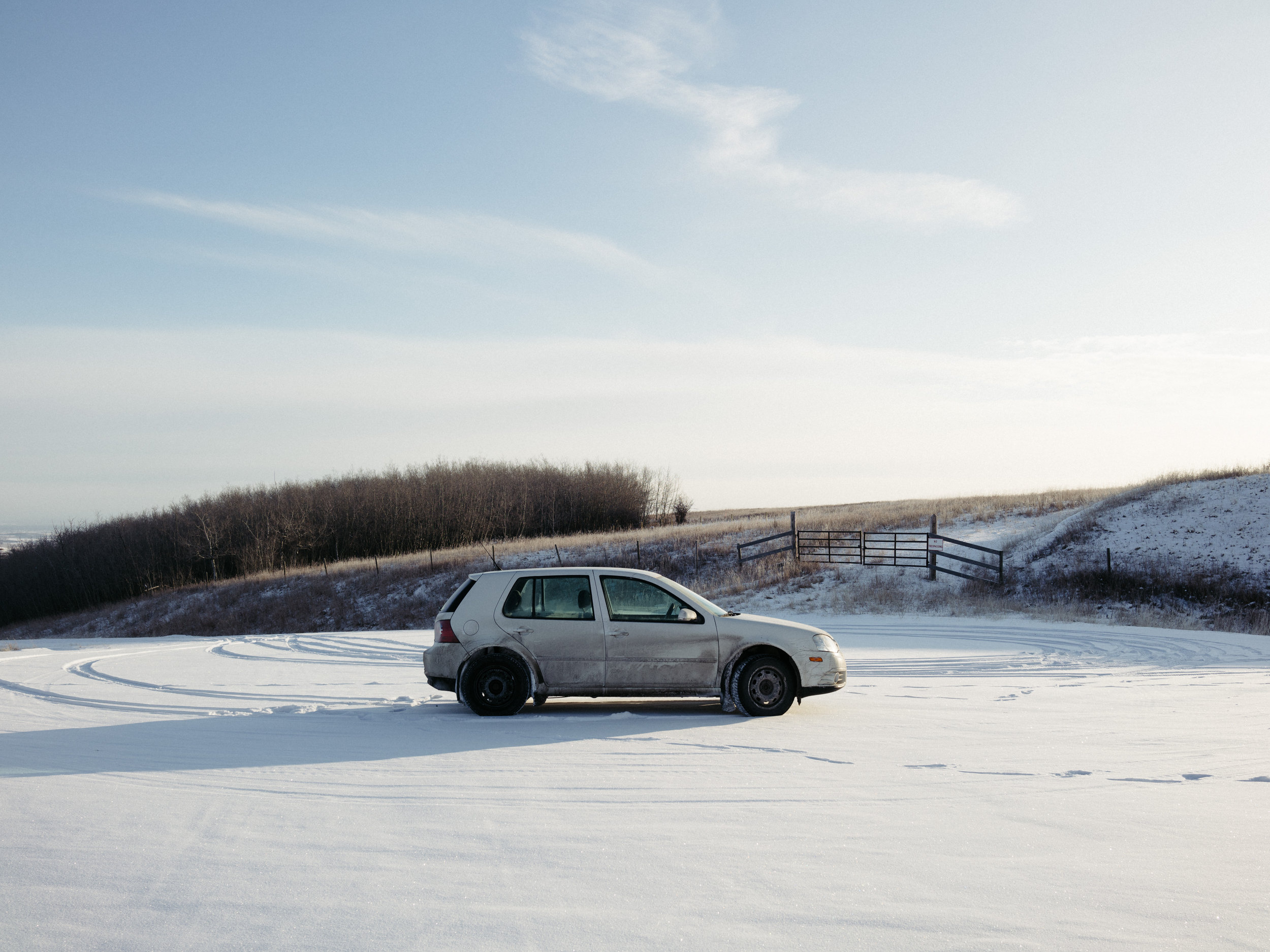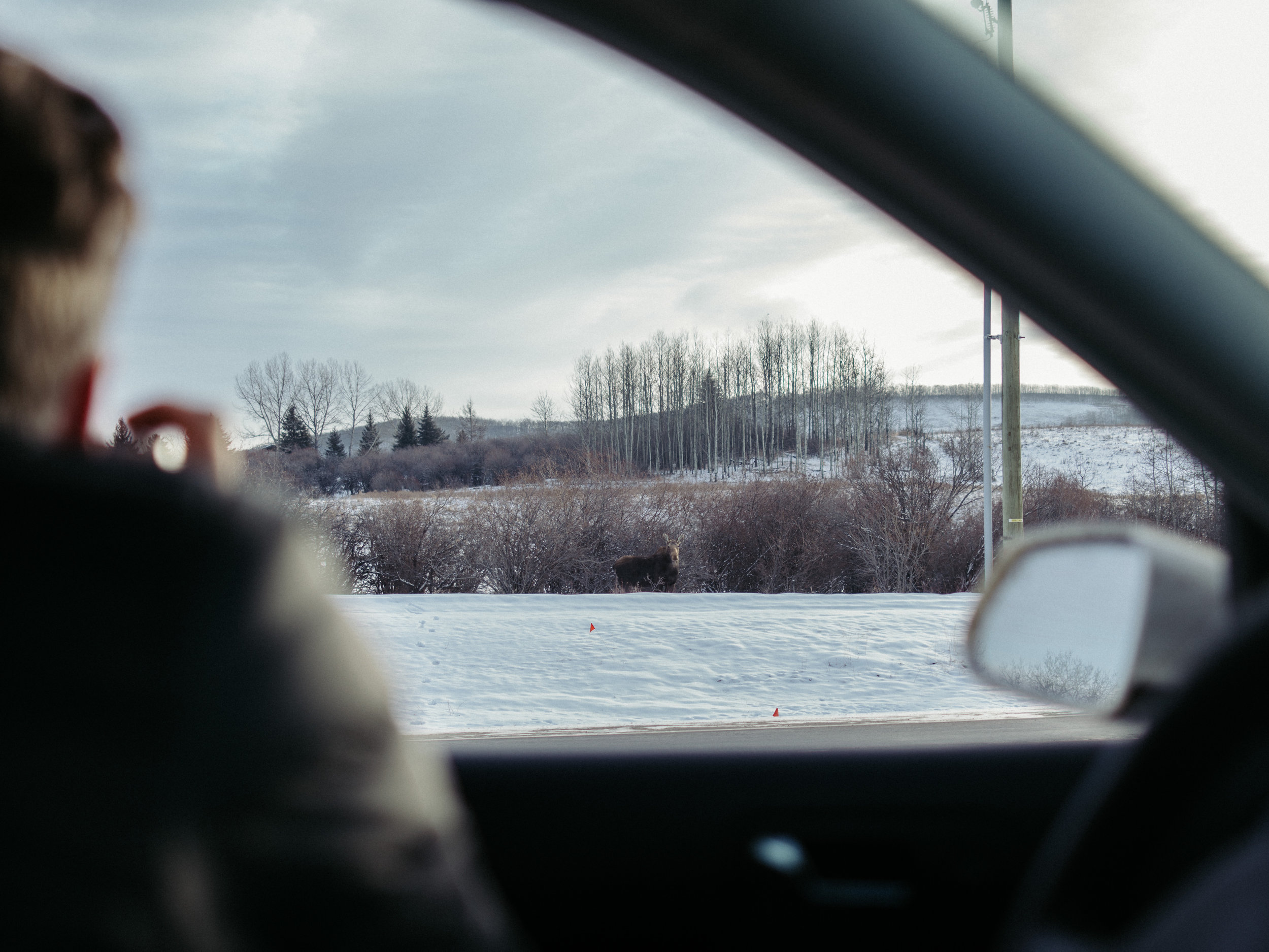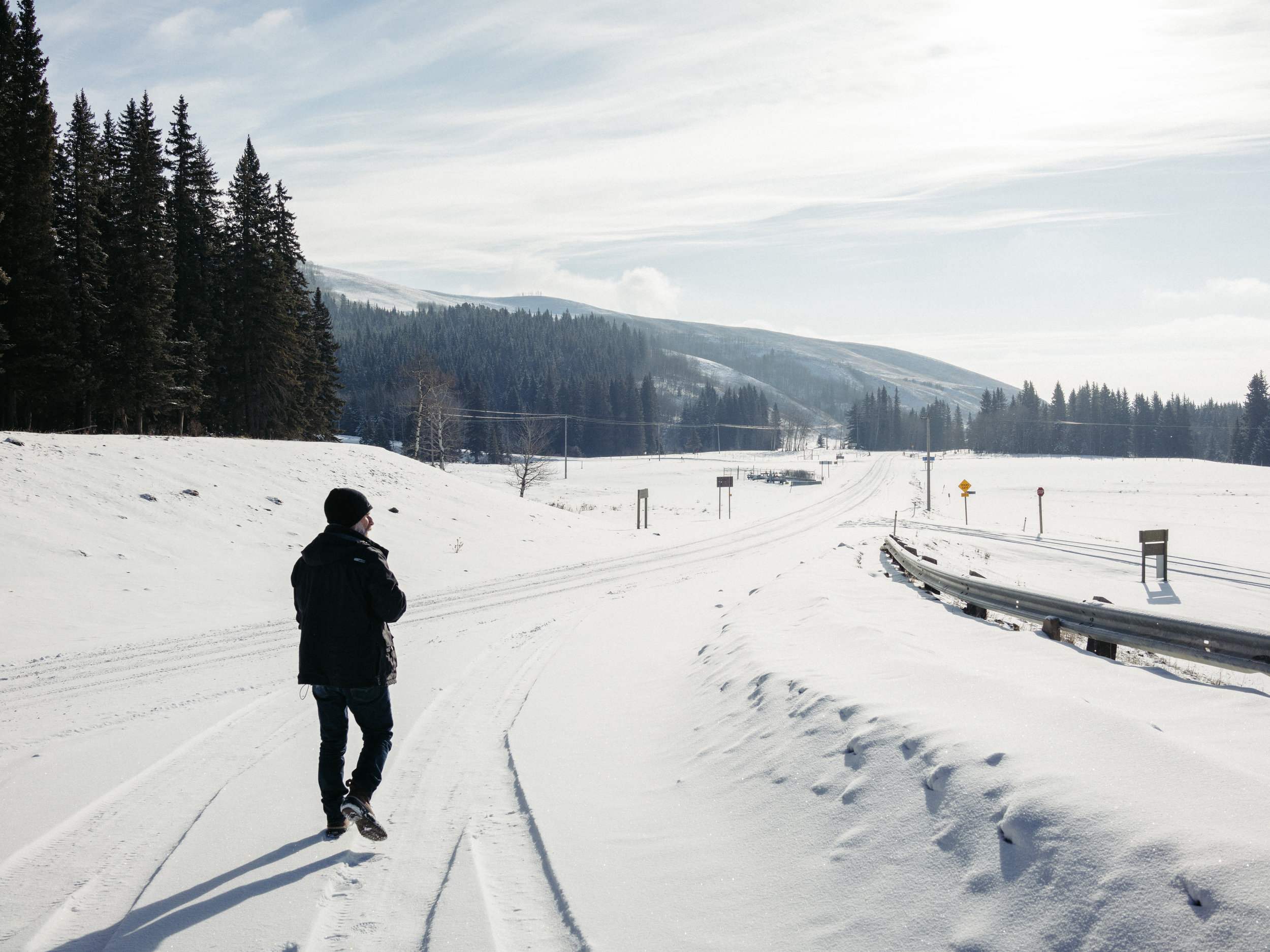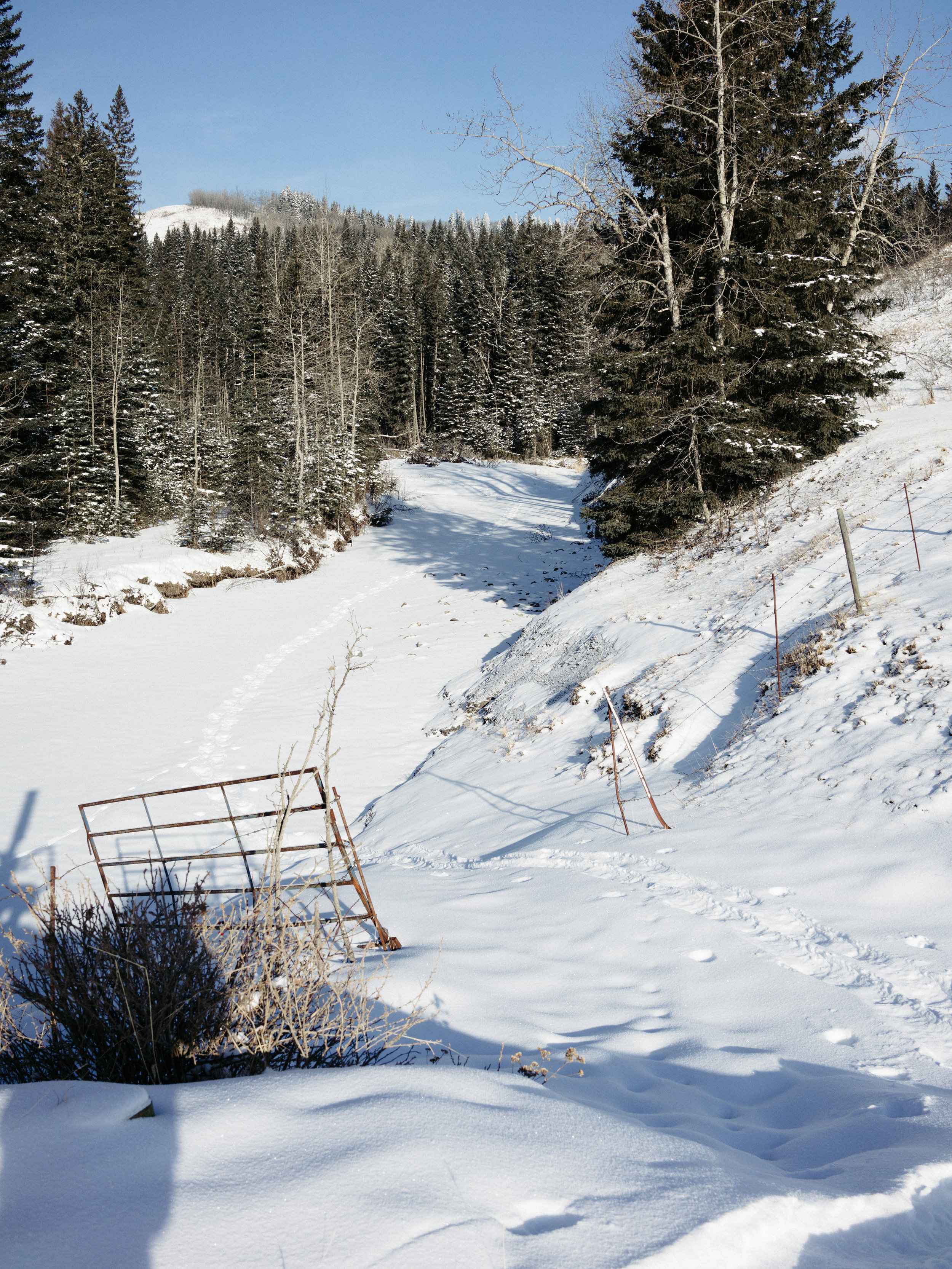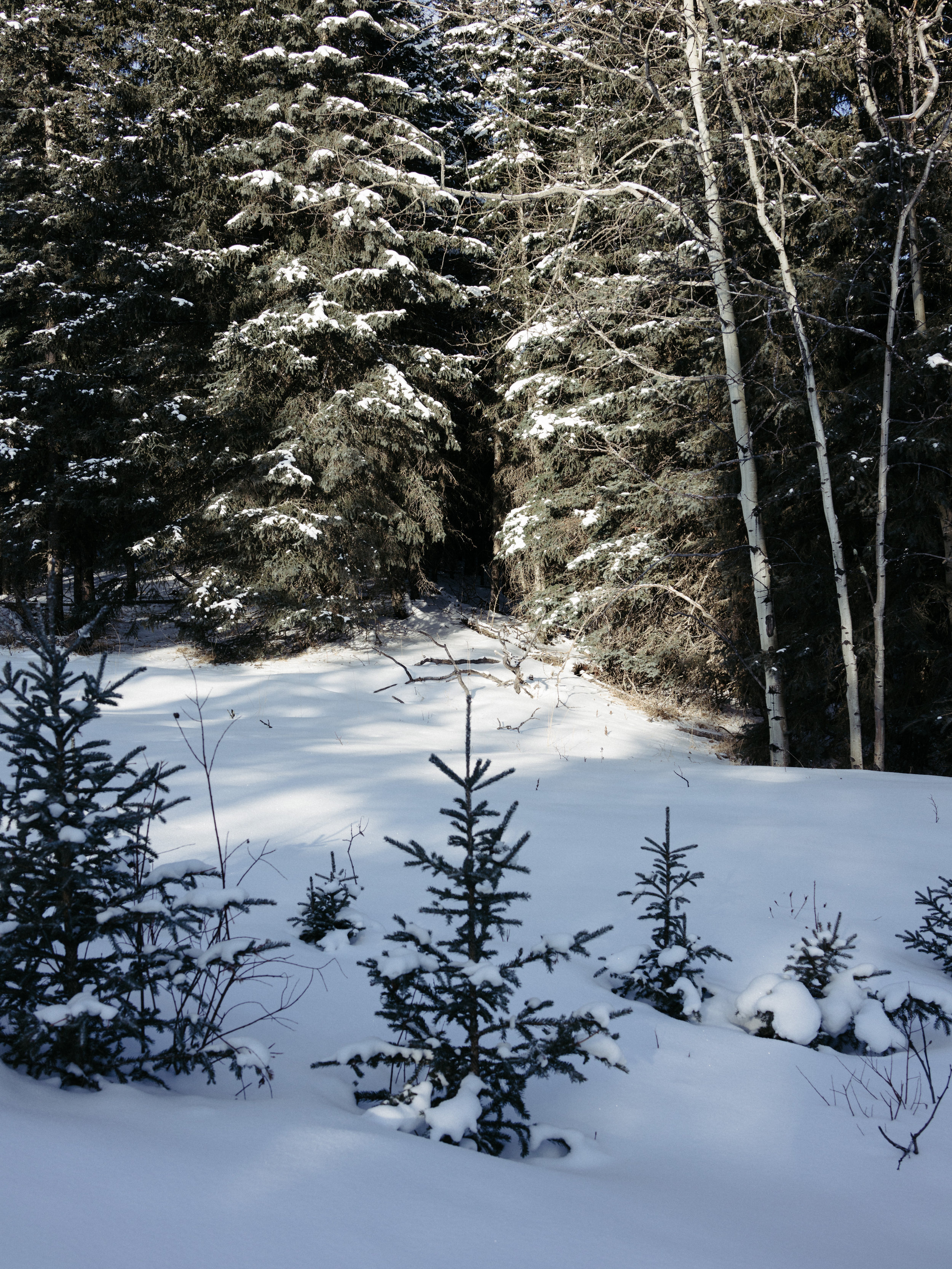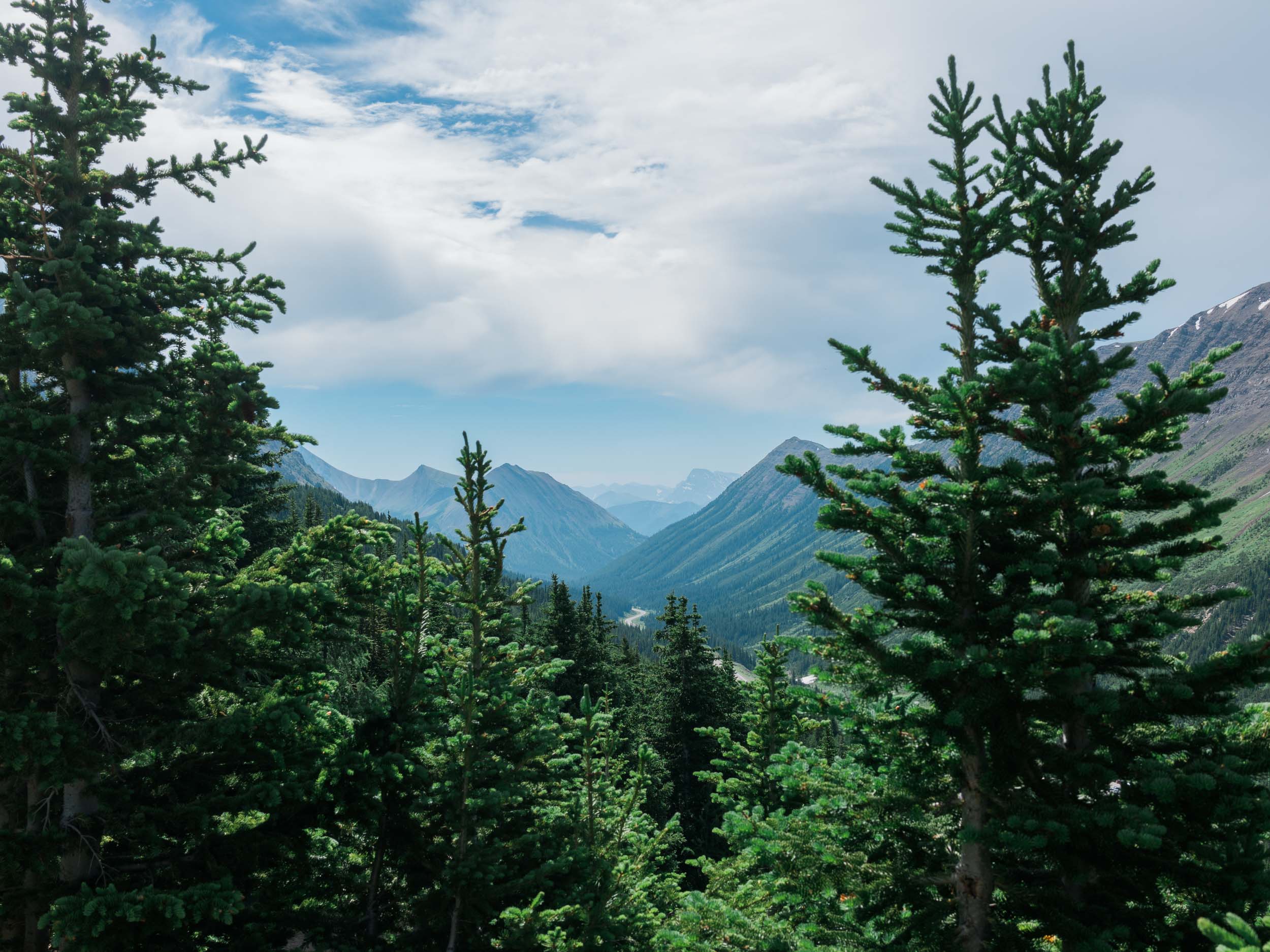
When hiking, one of the biggest photography challenges for me is making photos that work in mid-day light. Partial cloud cover helps soften the shadows.
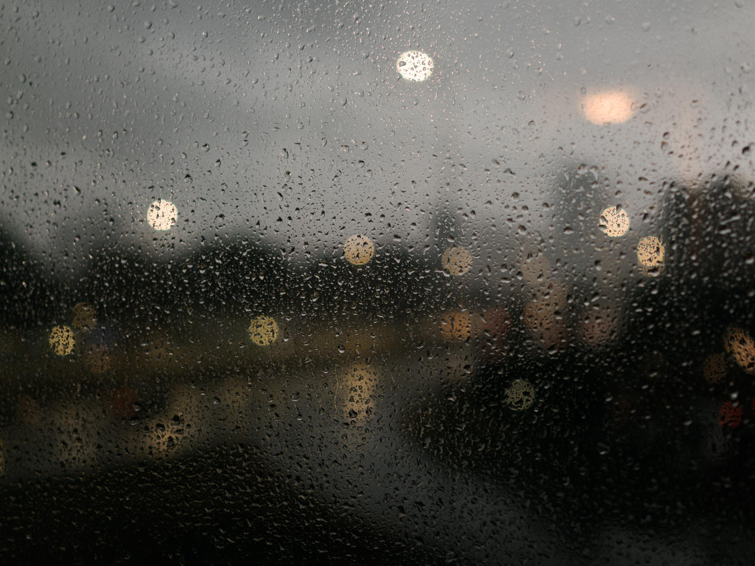
I love Saul Leiter's work with glass. The smeared colour in the photographs make them look more like paintings. This experiment wasn't successful, but it did make me go back and examine how Saul Leiter used glass to his advantage.
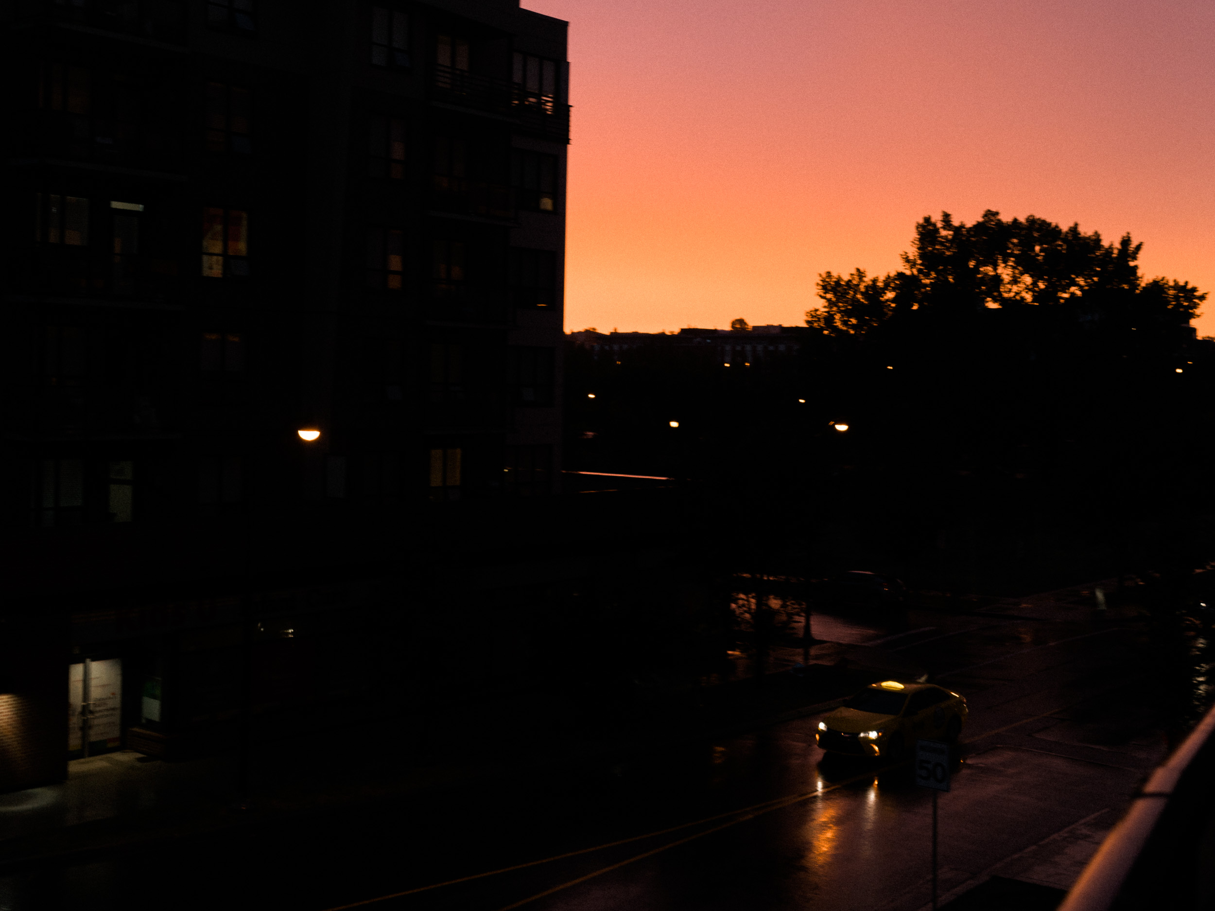
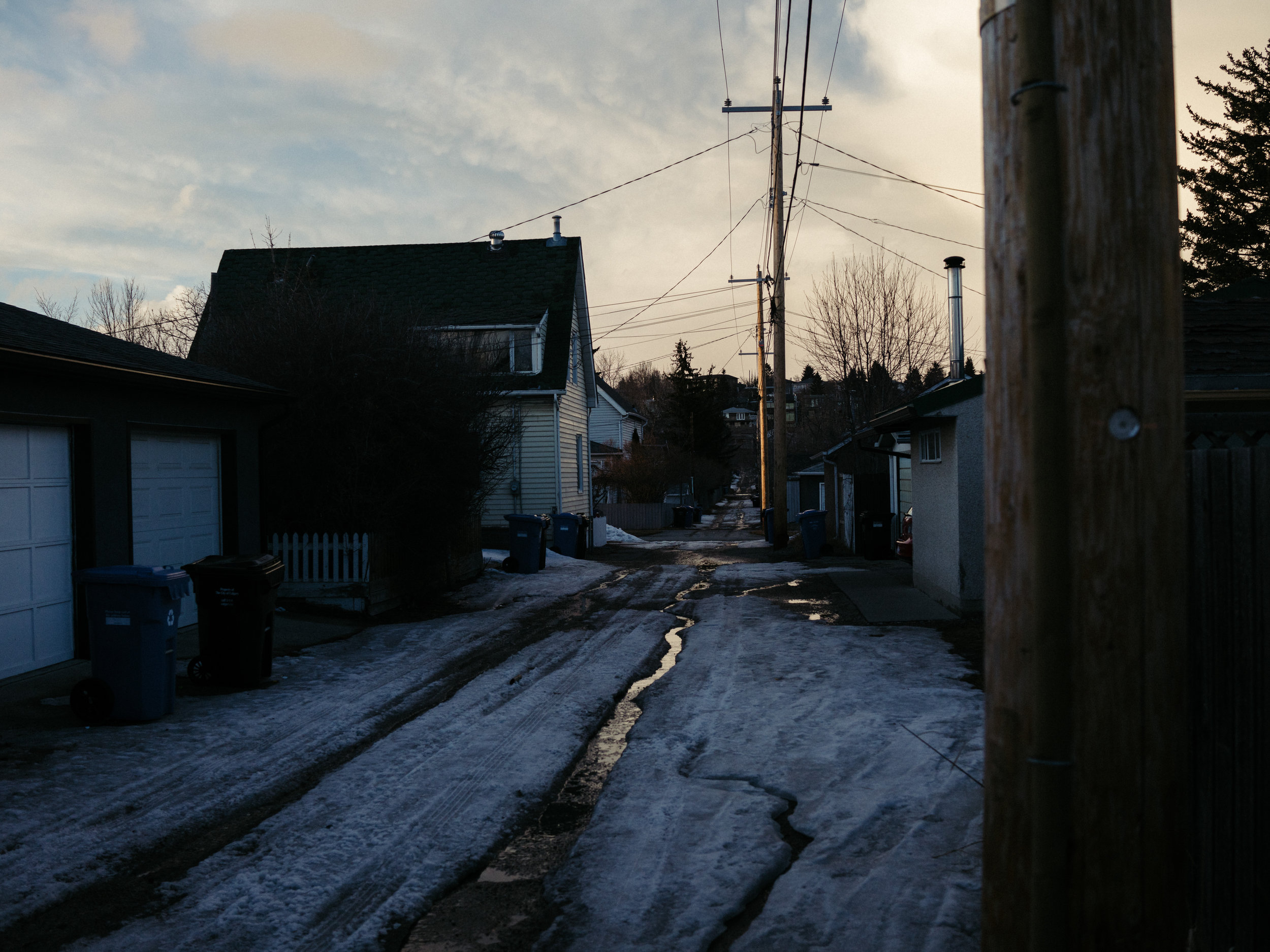
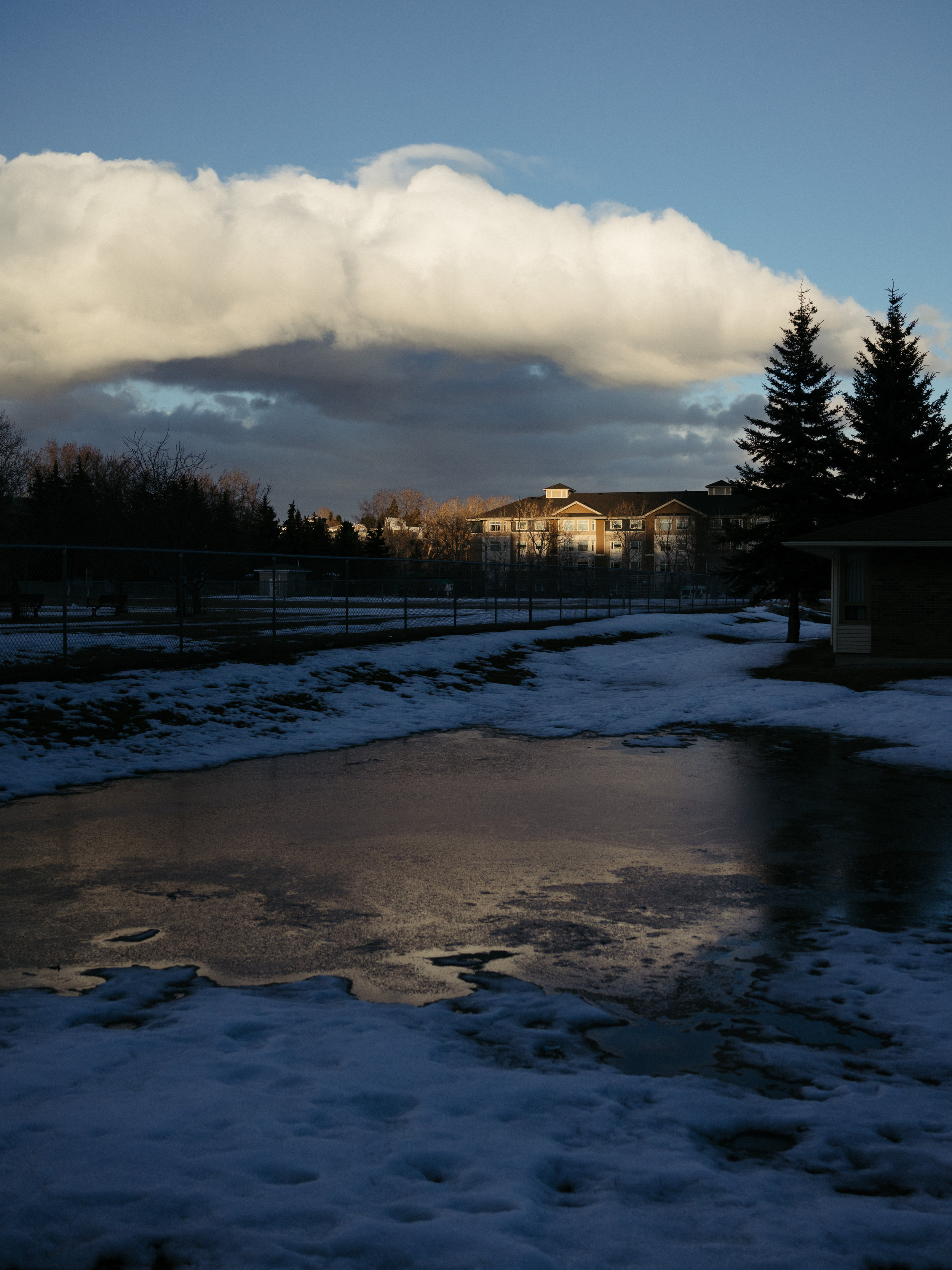
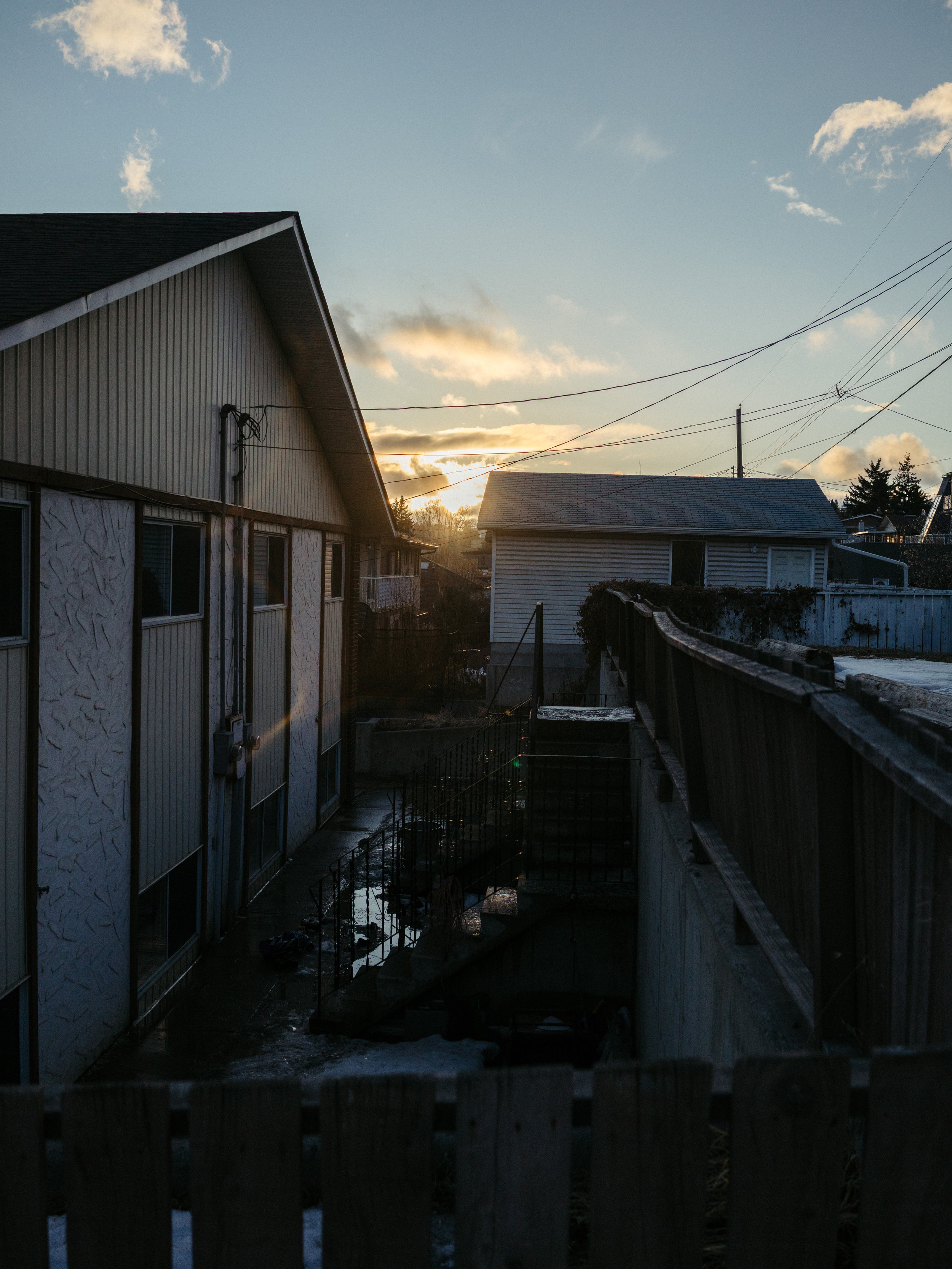
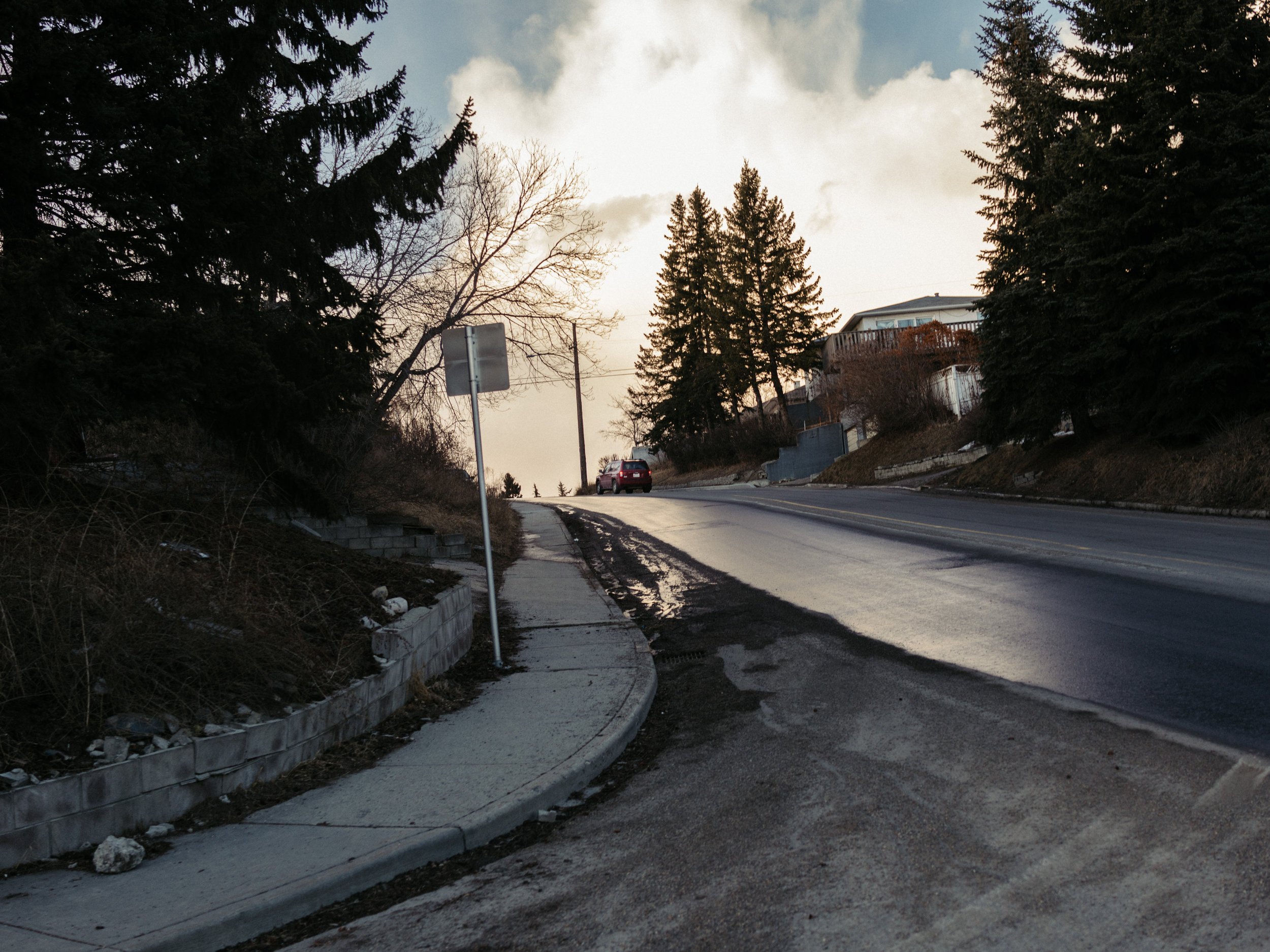
Epic sunset and light after a storm. I exposed for the sky which put most of the foreground in complete shadow.
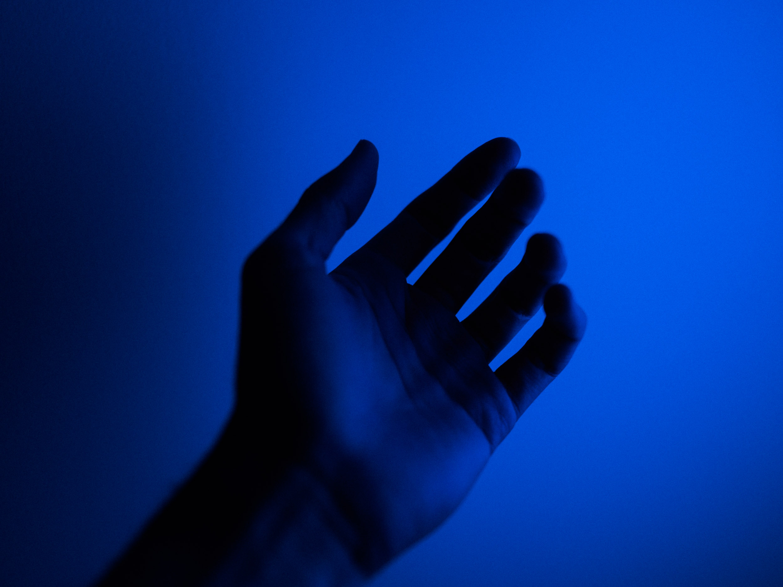
Experiments with coloured light. Blue is a powerful, vibrant colour on screen.
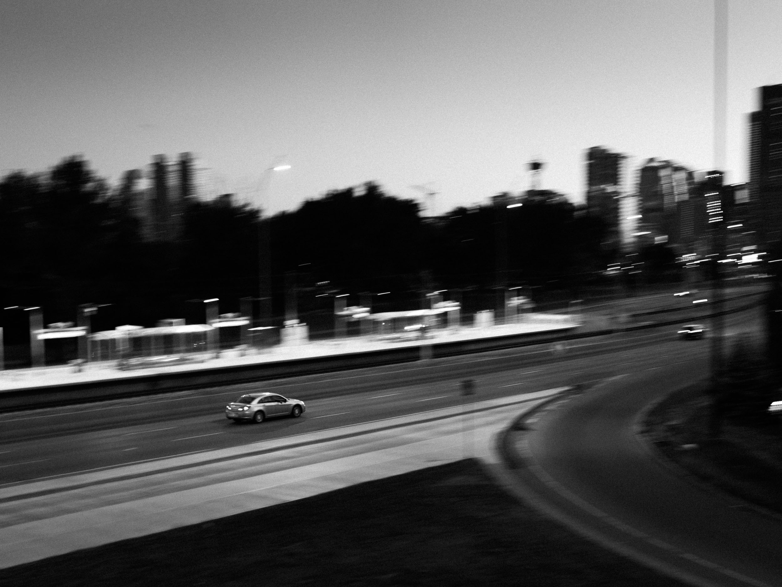
Part of the goal of these blog posts is about finding ways to make photos that look unlike my other photos. Panning, motion blur, and black and white made that happen in this one.
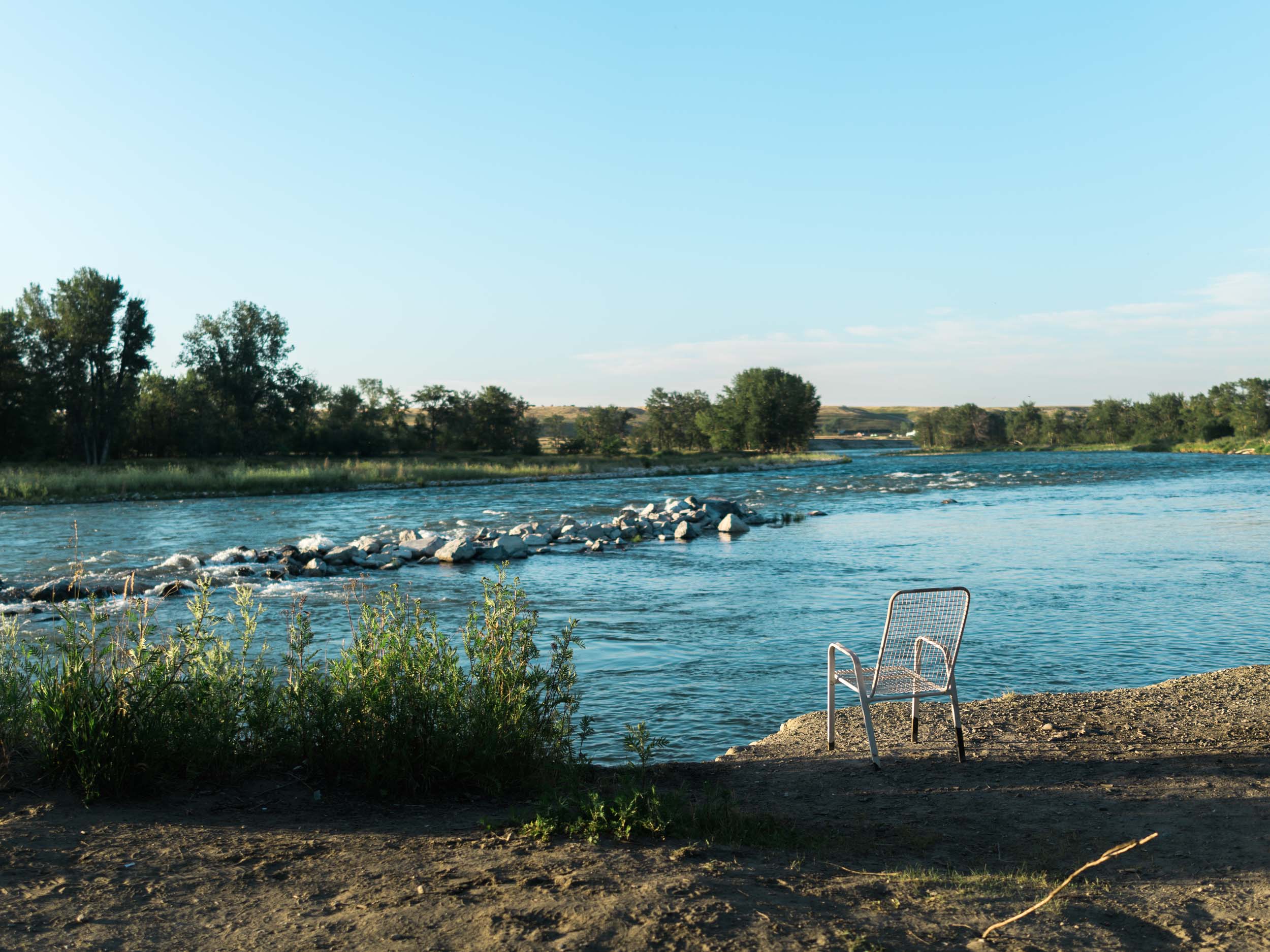
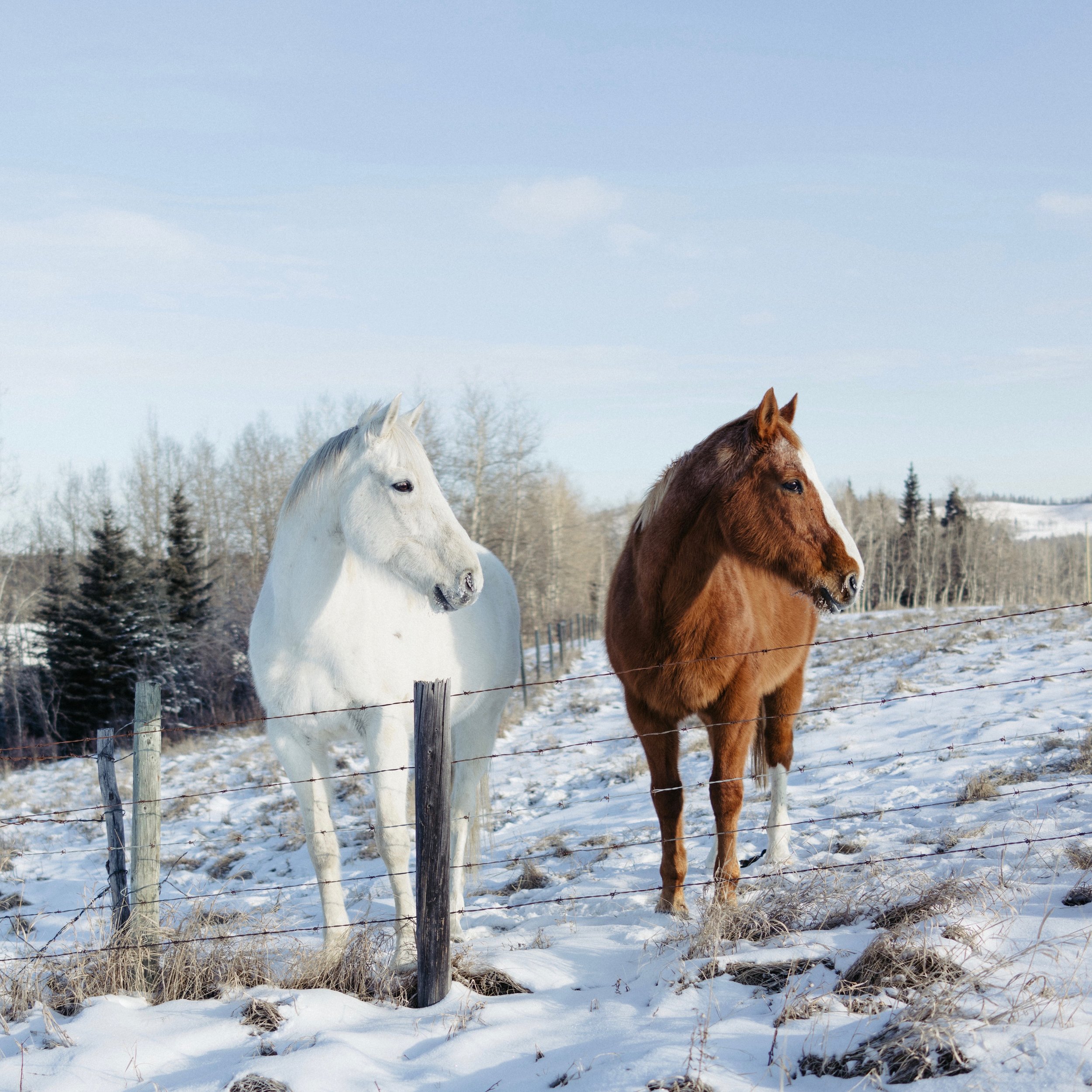
I was noticing a trend in my photos where I was centring the subject of my photo in the frame. This made for a bland composition when dealing with landscape or portrait aspect ratios. However, I've found centring works great for square aspect ratios. I'm trying to be more intentional about my usage of the rule of thirds again.
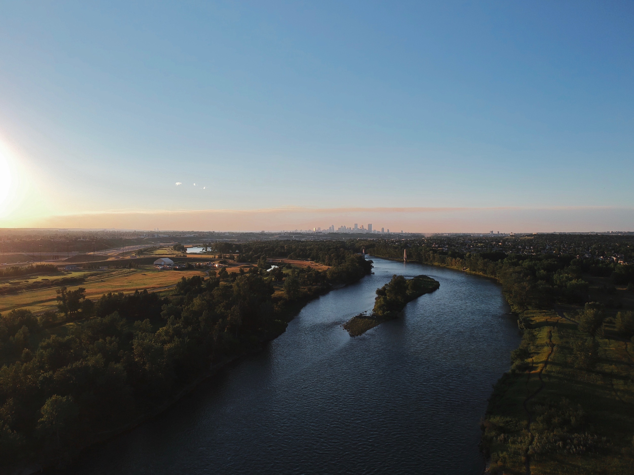
The Bow River in south Calgary. I'm limited to taking JPGs in my aerial photos so I've had to be more aware of the dynamic range. My “big” camera is extremely forgiving, especially when shooting raw, so this is a nice reminder to double check the exposure.
